overview
Designed the digital experience for a $72M-funded next-gen narrow bank platform.
We helped shape the product and digital presence for N3XT, supporting an 18+ month engagement across brand, product, and web.
3 months
From an idea to the MVP launch
18+ months
Ongoing design and development partnership
$72M
Raised while in stealth

Aurelien Bonnel
CTO @N3XT
about the project
N3XT is rebuilding payments from the ground up: instant, transparent, and free of the hidden machinery of traditional banking. But the very thing that makes the product radical also made it almost impossible to explain. We were brought in to turn an intricate financial system into a brand people grasp in seconds and trust immediately; and then to carry that clarity through everything N3XT would launch with: product, website, collateral, pitch deck, and the motion launch video that introduced them to the world.
When we met N3XT, they were still in stealth. 6 months later, they went live with a complete brand, a live product, an investor-ready story, and a raise of $72M behind them.
This case study explains how we got there.
Client
N3XT
Services
Brand strategy & identity · Product design · Web design & development · Marketing collateral · Pitch deck · Launch film
Timeline
2024 - present
The challenge
The hardest problem wasn't visual. It was comprehension.
N3XT had a genuinely new financial system and almost no way to make people understand it. The mechanics that justify the company are invisible to the people it needs to reach, and explaining them usually loses the room.
On top of comprehension, they had to look like a bank you would trust while looking nothing like the rest of fintech, and they had to do it on a launch clock. The brand wasn't decoration. For a company asking the world to move its money onto a system no one had heard of, it was the first proof of trust.
"We really struggle with this, because a lot of the reasons the company was created are things that are not well known by people. The way financial markets work, the way banking works. We've experienced them first-hand, but very few people are actually aware of them."

Aurelien Bonnel · CTO, N3XT
Hard to explain
A complex financial system had to make sense in seconds, to a CFO and a developer alike, without being dumbed down.
Has to feel trustworthy, but look different
As credible as a bank, while looking nothing like the blue-and-purple every other fintech uses.
A crowded, confusing market
N3XT sits between bank payment platforms, consumer wallets, card networks, and crypto. We had to place it clearly.
A lot to build, fast
A full product across web and mobile, a brand, a website, and an investor story, all on a launch deadline, all delivered within 6 months.

Brand discovery
Before a single pixel, we ran N3XT through our brand discovery process, led as two deep working sessions with the founder.
We deliberately set the finance and the tech to one side and rebuilt the company as a story - because a story is the only format the human brain reliably understands in three seconds.
Working through the StoryBrand model across three pillars, customer, market, and brand, we reframed the entire narrative around a single principle: the customer is the hero, and N3XT is the guide. Not the genius product shouting about itself, but the trusted advisor who hands the hero a plan and removes their fear. The hero became the finance leader haunted by one question, has the money actually arrived? The villain became the instruments nobody questions: cards, chargebacks, and the opaque "trust me" of the existing system.

applying the framework
We opened with a deep working session with the founder, run as a story rather than a finance lecture, because a story is the only format the brain reliably decodes in seconds.

the search for a color
This is where the strategy got stress-tested in pixels. We didn't land the look in one pass; we argued our way to it across three rounds, starting where the strategy pointed: something vibrant and confident.
The first directions (VE 1.0 through 3.1) ran with acid green and yellow. High-energy, unmistakably not-a-bank, a clean break from fintech convention.

TESTING ORANGE accents
In review, the team kept coming back to orange. The reasons were sound: warmer than green, more human, more ownable, and almost unused in finance. But a direction chosen on strategy doesn't get swapped on a hunch, so we tested it properly.
We ran orange head to head against blue, purple, and dark green, so the call would be deliberate rather than reactive. Orange won. It held the energy and warmth of the early work without feeling unserious, and it claimed space no competitor owned.

DIALING IN THE TONE AND THE MARK
Two things got settled here at once: the exact orange, and the logo. We ran two orange tones side by side across the whole system, the original and a warmer, adjusted one, until the final tone was clear.
In parallel, the logo came down to a single character: the 3 at the heart of the N3XT name. We tested how the 3 sits inside the wordmark and how far it could be pushed on its own, until it worked as a standalone mark you would recognize anywhere, in an app icon, a favicon, a single tile.


IDENTITY SYSTEM
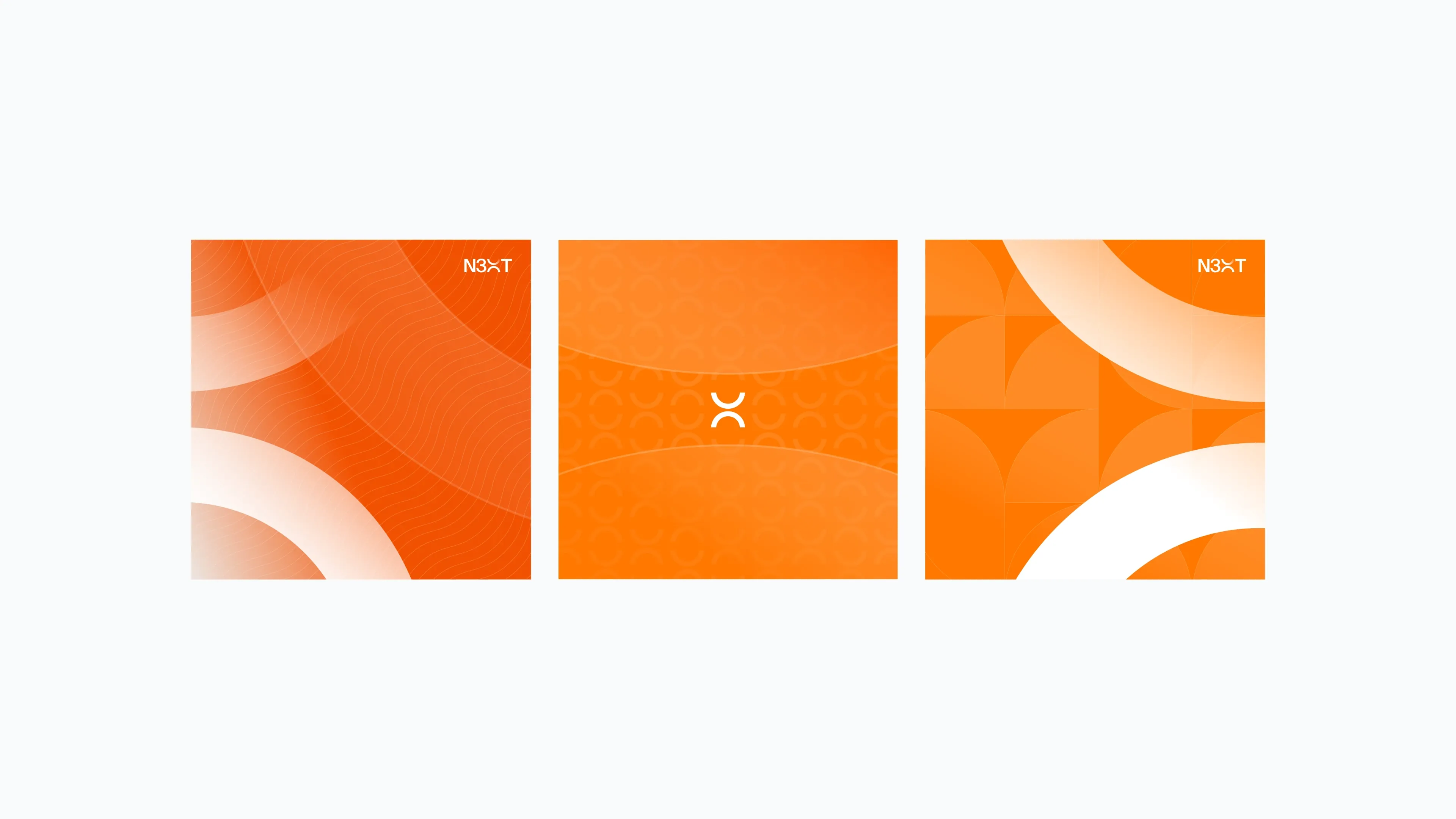
From the chosen direction we built the full toolkit: the N3XT wordmark, an icon set, type, and usage rules, engineered to flex across product, web, and print without losing coherence.
A system the team could run with, not a logo handed over in a vacuum. Two brand iterations refined the wordmark, the icon, and the exact palette into the final identity that now carries the company.
INFORMATION ARCHITECTURE
Before drawing screens, we mapped the entire product. Every page, every state, every decision point, so the architecture drove the design rather than the other way around.
For a product this dense, with approvals, transactions, instant payments, requests, internal transfers, and team roles, the IA is the real foundation. Getting it right first is what let us move fast later without the structure collapsing under its own weight.

dashboard direction
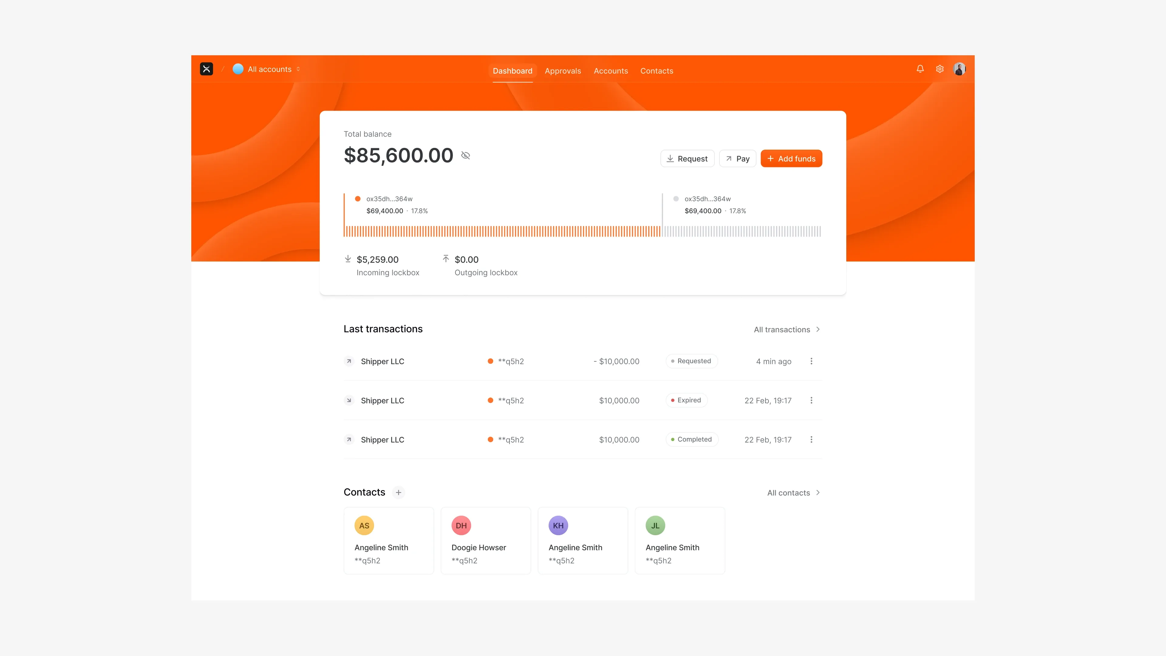
Before committing the whole product, we ran the main dashboard in high fidelity across five visual explorations, light, dark, and orange. The goal was to lock the visual direction early and fast.
The dashboard is the heart of the product, so we used it to settle the look before scaling it everywhere. Resolving the visual language up front meant every screen after it could be built with confidence rather than guesswork.
THE FINAL ARCHITECTURE
After multiple sprint reviews with stakeholders, we went back and mapped the final, definitive information architecture, the version every flow would be built against.
Real products don't get architected once. We iterated the structure live with N3XT across sprints, then locked it, so the full build rested on an agreed foundation rather than a moving one.

MAPPING EVERY FLOW
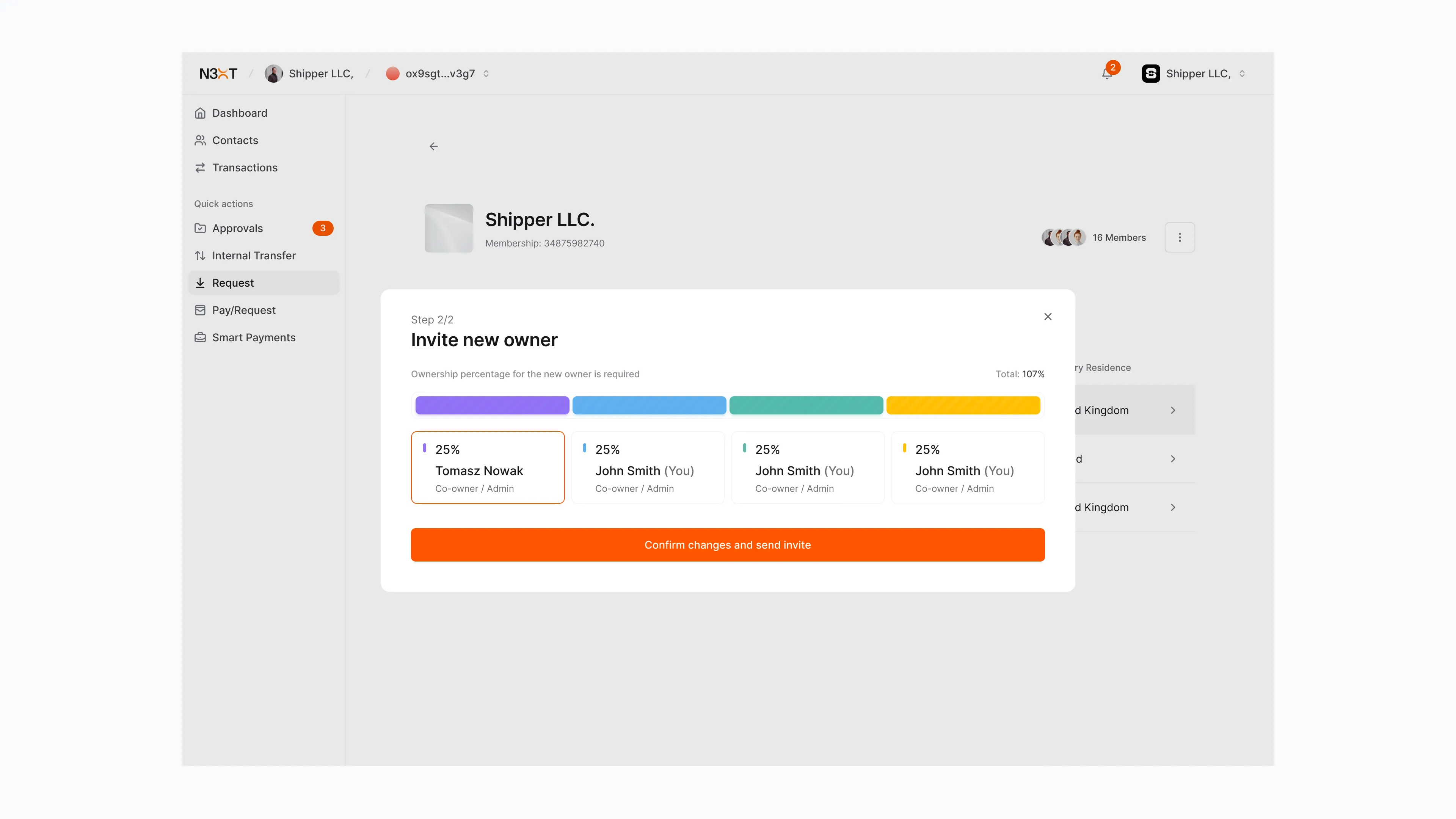
Then we wireframed every single flow in full, in low fidelity. Sign-up, dashboard, approvals, contacts, transactions, instant payments, requests, pay-after-delivery across admin, member, payer and provider sides, internal transfer, profile and business settings, and more.
Nothing was left as a "we'll figure it out in build." Every path, every role, every edge case was drawn. This is the part of the work that rarely gets shown and almost always decides whether a product actually ships.
300+ screens. Web app and mobile app. Roughly four months.
We could move this fast because the foundations, the brand, the visual direction, and the architecture, were all agreed early. The speed came from doing things in the right order, not from cutting corners.

DESIGN SYSTEM
None of that speed happens without a system underneath it. We built N3XT a full design system: design tokens, a complete component library, and light and dark theming throughout, all structured to atomic-design principles.
A proper system is what lets a small team design 300+ screens consistently and quickly. You build the small pieces once, use them to assemble any screen, and when you change one setting the whole product updates.


ONE COMPONENT
Take the context menu. It ships in light and dark, with every item state defined, default, hover, and disabled, plus checkbox and radio variants, nested levels, and submenus.
Every component in the library is built in this much detail, so any screen can be put together quickly and consistently, and the product behaves the same way everywhere.

final product
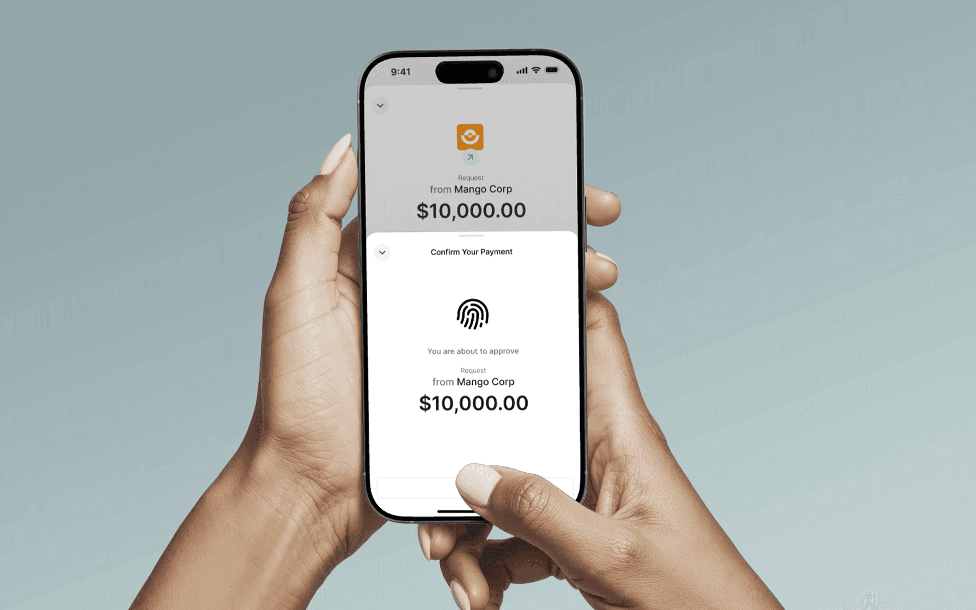
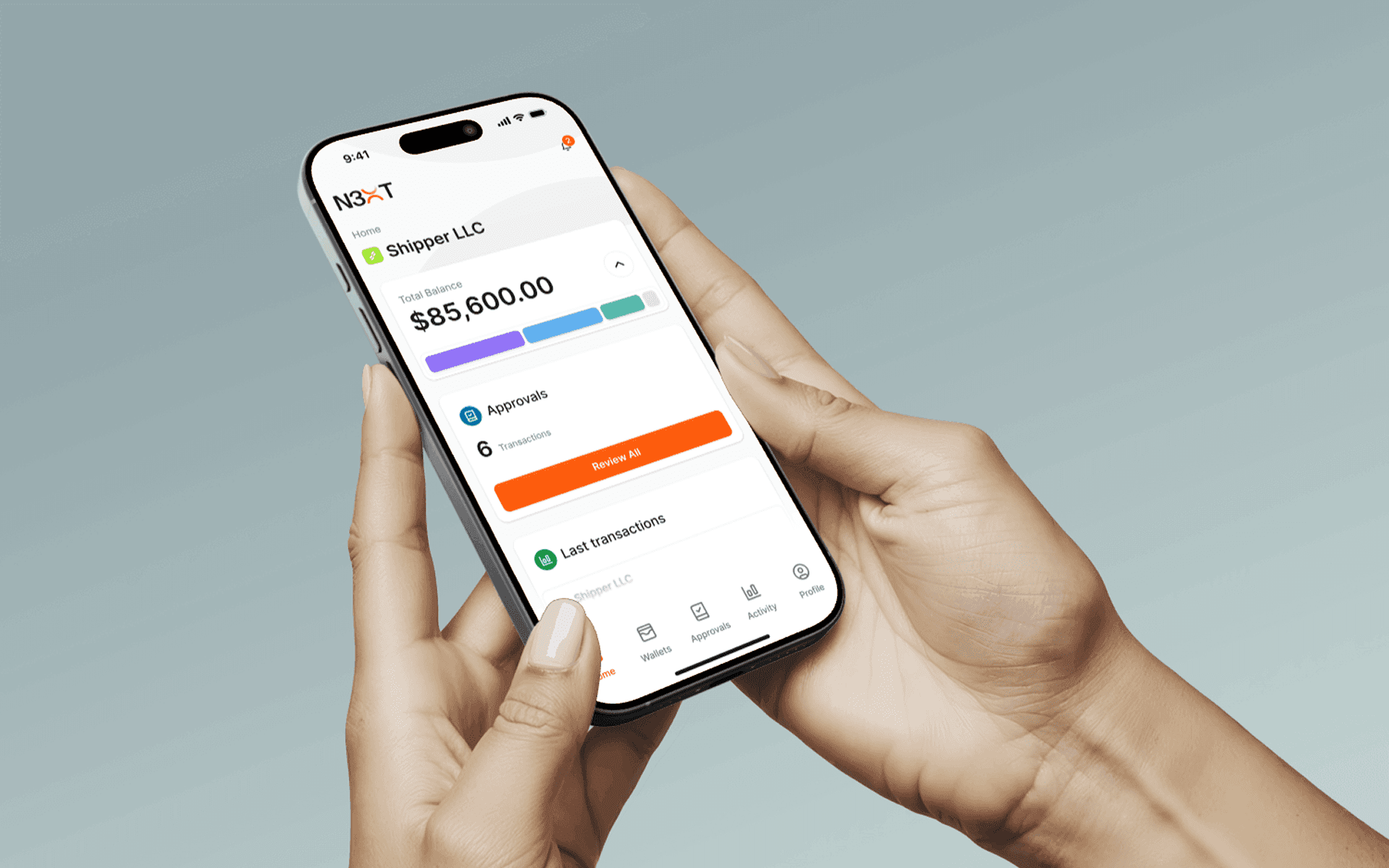
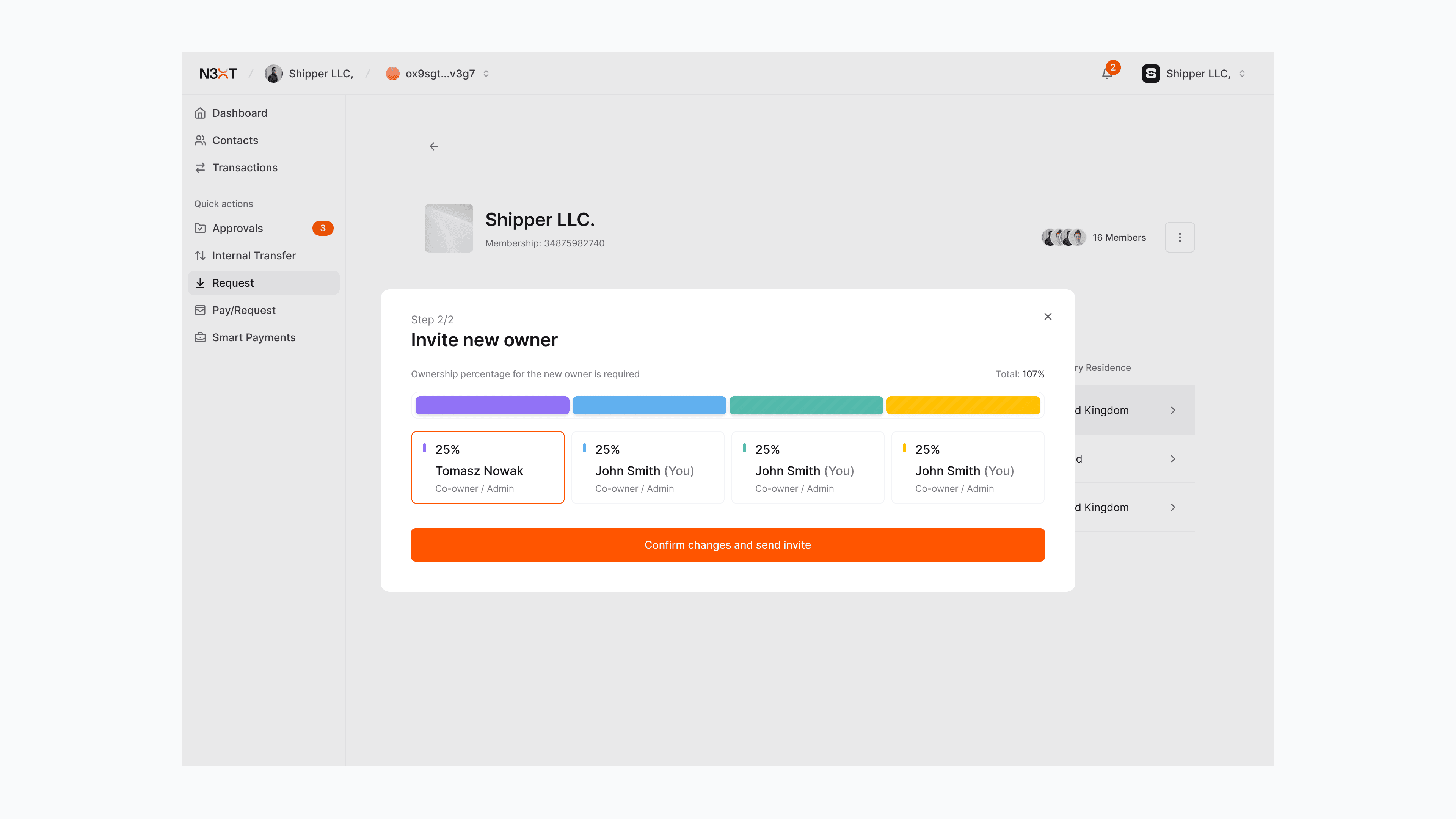
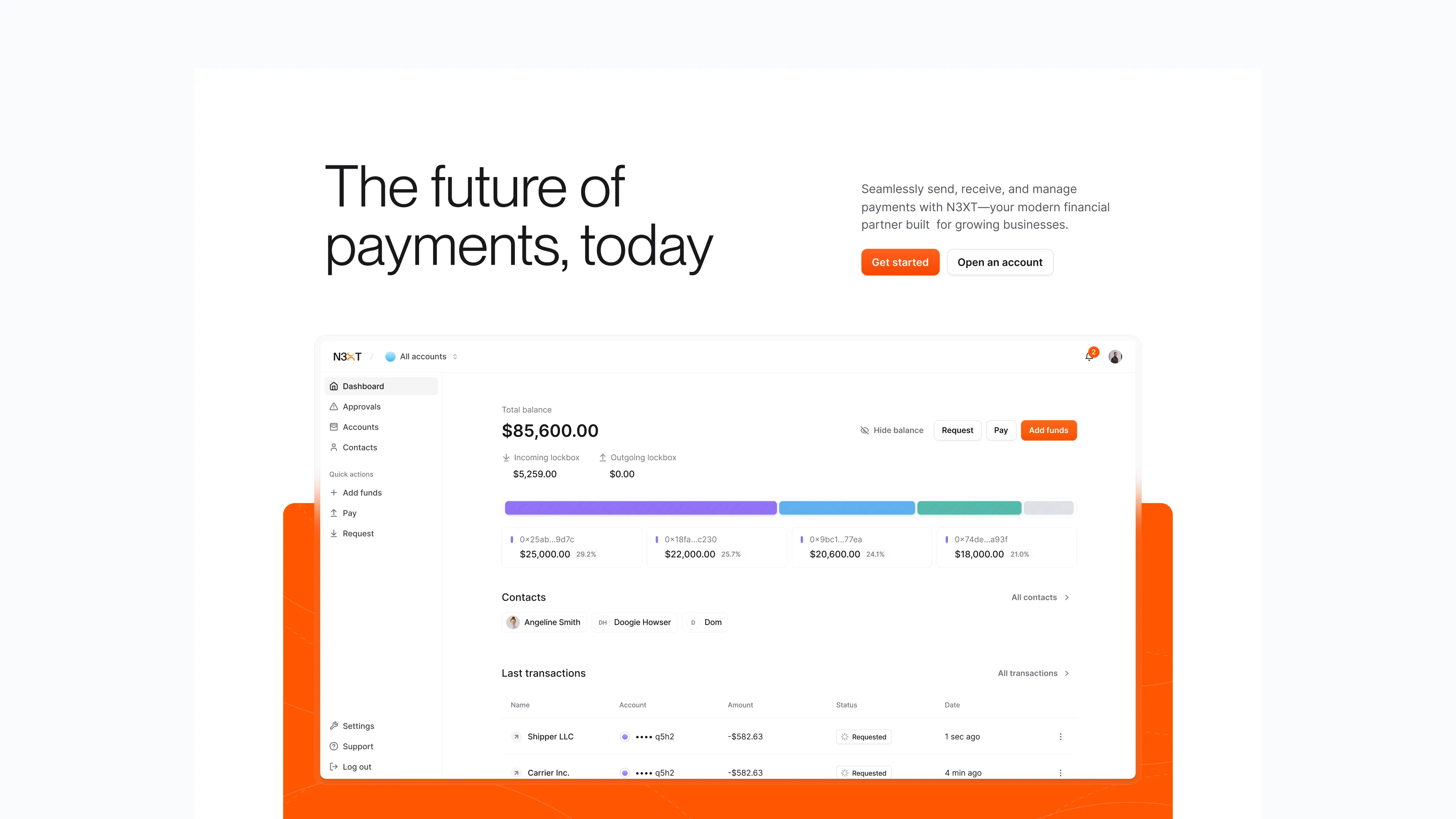
With the brand as foundation, we designed the experience around the three things that justify N3XT existing:
Instant payments
Money that's genuinely there, the moment it's sent.
Verified counterparties
Certainty about who you're paying and being paid by, removing the trust gap businesses currently paper over.
Programmable payments
Money that can carry logic, so payments behave like software rather than paperwork.
The throughline from discovery drove every flow: move the user from ambiguity to certainty. No grey areas, no "did it arrive?"
The throughline from discovery drove every flow: move the user from ambiguity to certainty. No grey areas, no "did it arrive?"



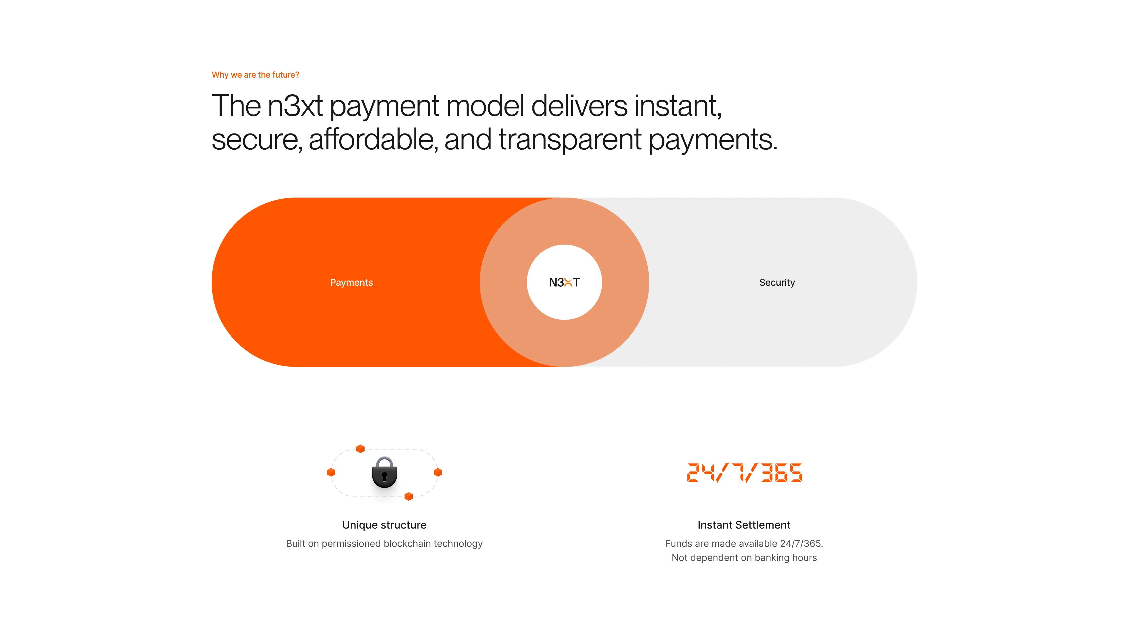
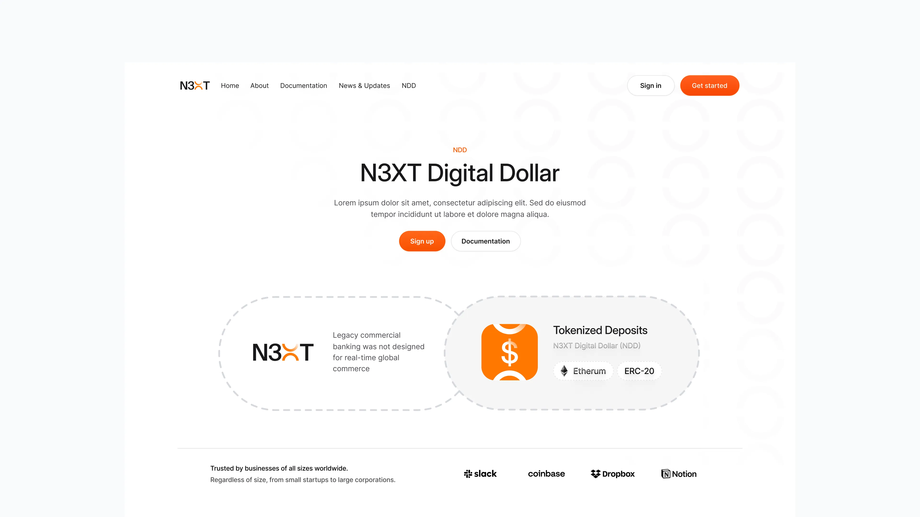
the website
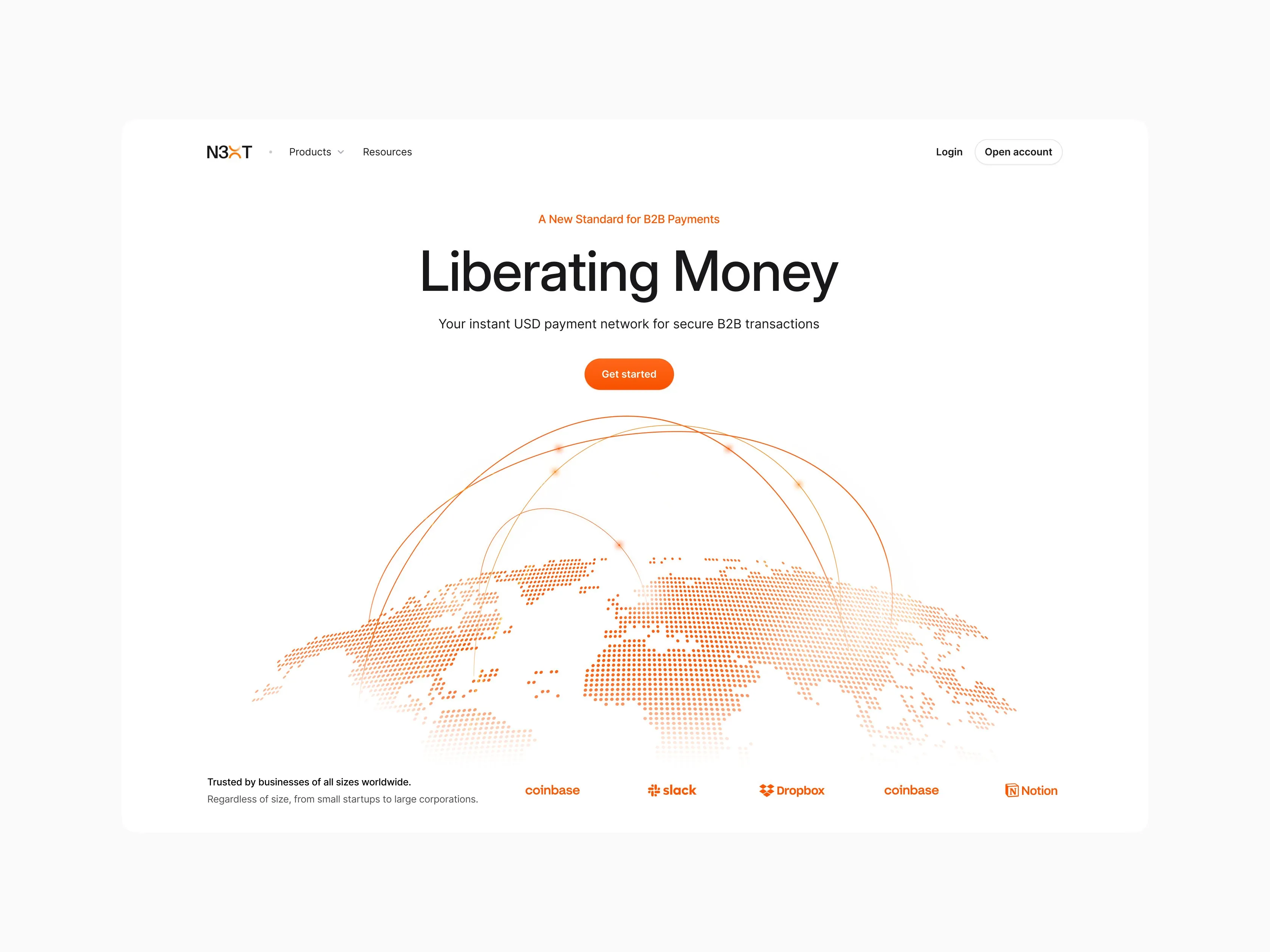
The first thing the market would see out of stealth, designed and refined alongside N3XT's leadership and their communications partners.
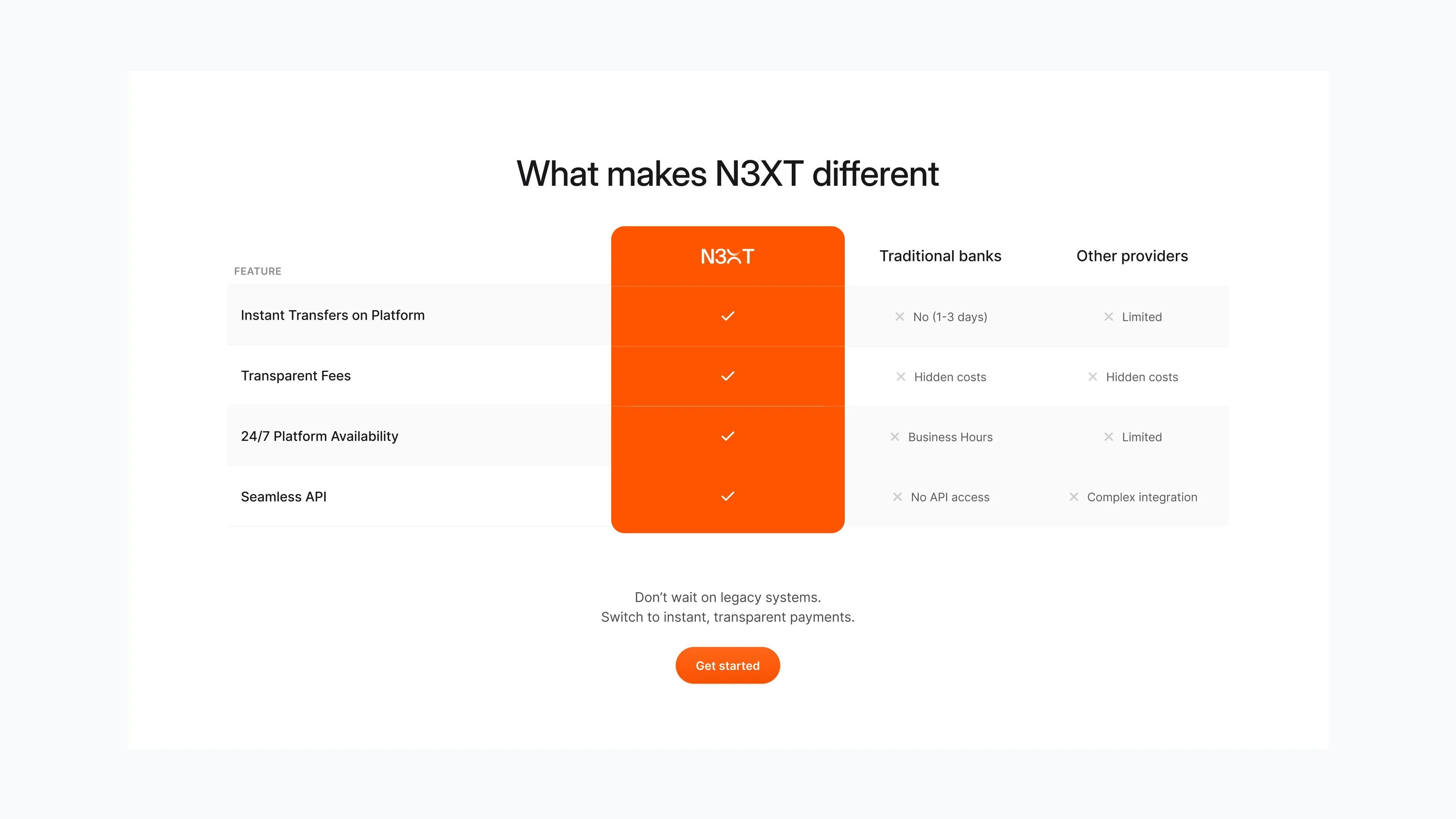
The hardest constraint was a dual audience on one page. Decisions we made and why:
A brand-led hero, not a UI screenshot.
The launch film and motion-led graphics open the site, so the first impression is what N3XT means, before what it looks like.
A "how it works" that respects the reader.
We compressed genuinely complex mechanics into a few clear steps a newcomer could follow without a finance background.
Two clean paths.
Sign-up and support for finance teams, a dedicated route to API docs for developers, without either crowding the other.
Credibility, carefully staged.
Mission, vision, leadership, and investors, sequenced to build institutional trust. We deliberately handled the investor section with restraint: enough to signal backing, not so much it undercut N3XT's standing as a bank.
marketing collateral
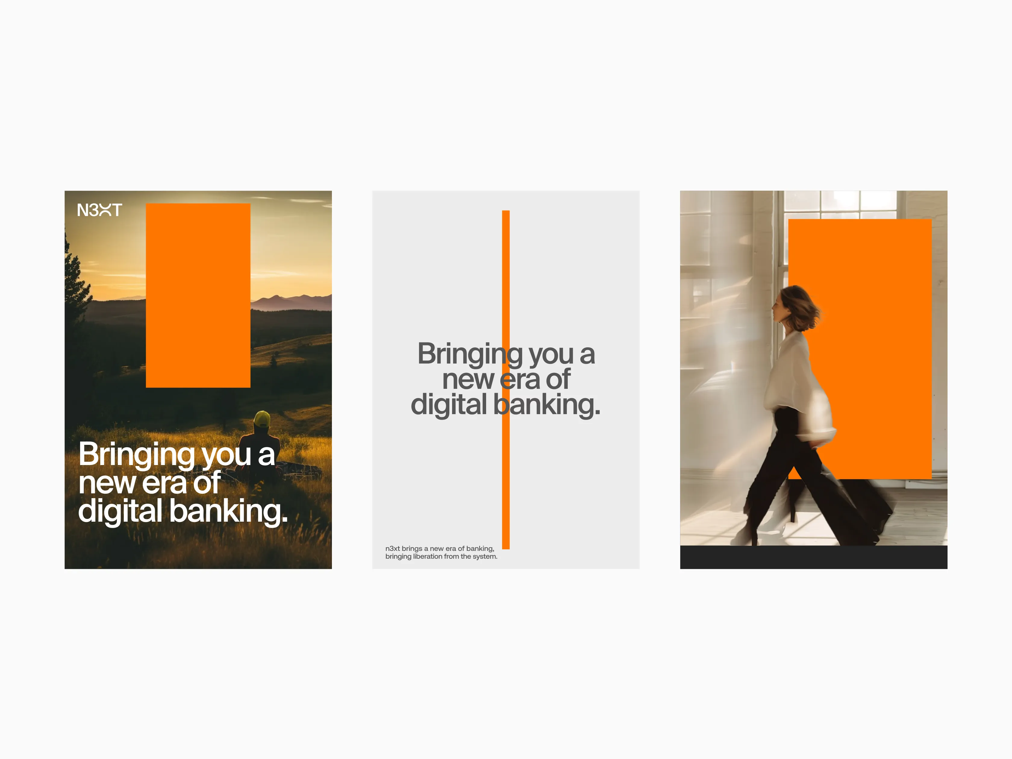
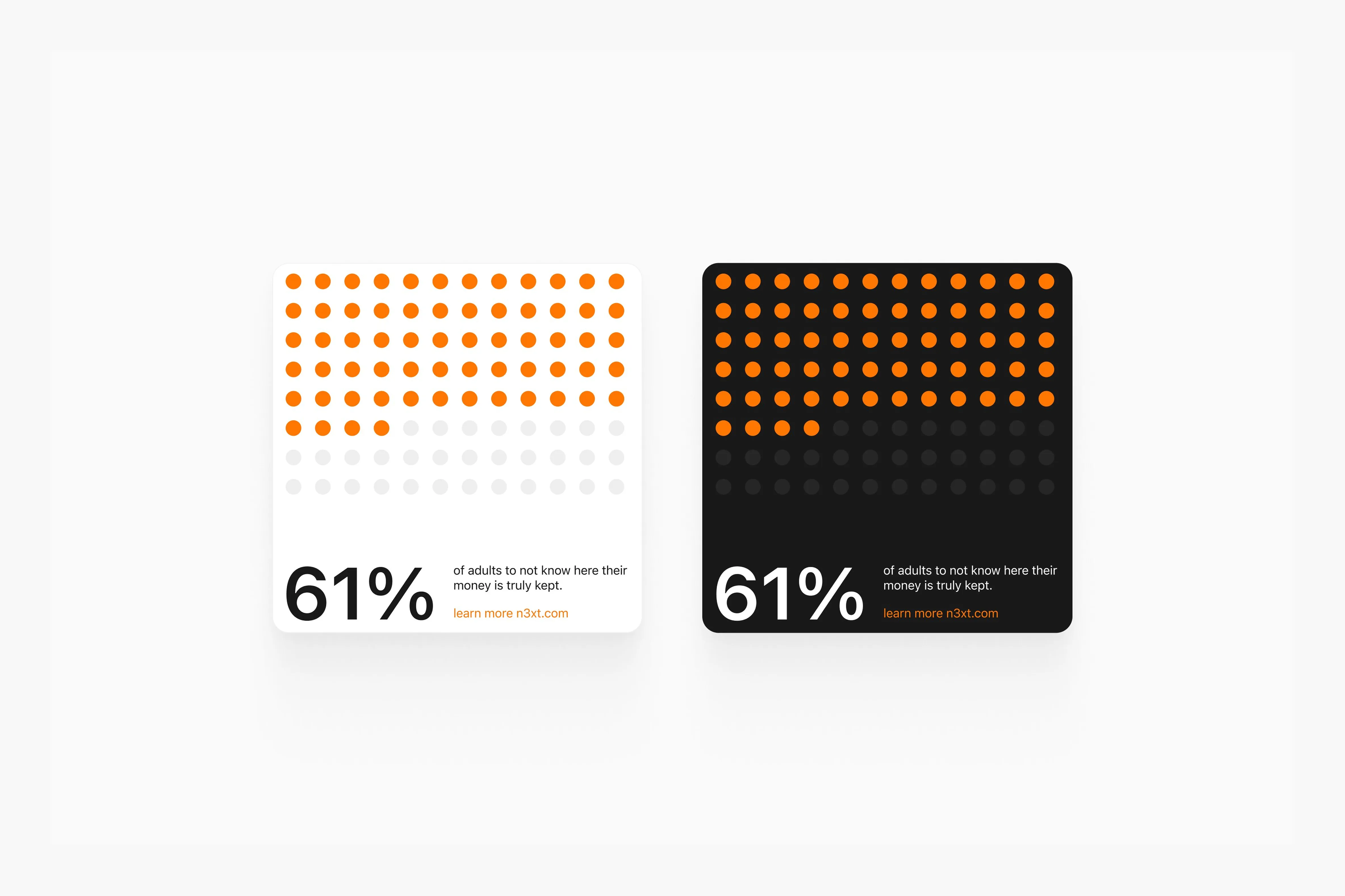
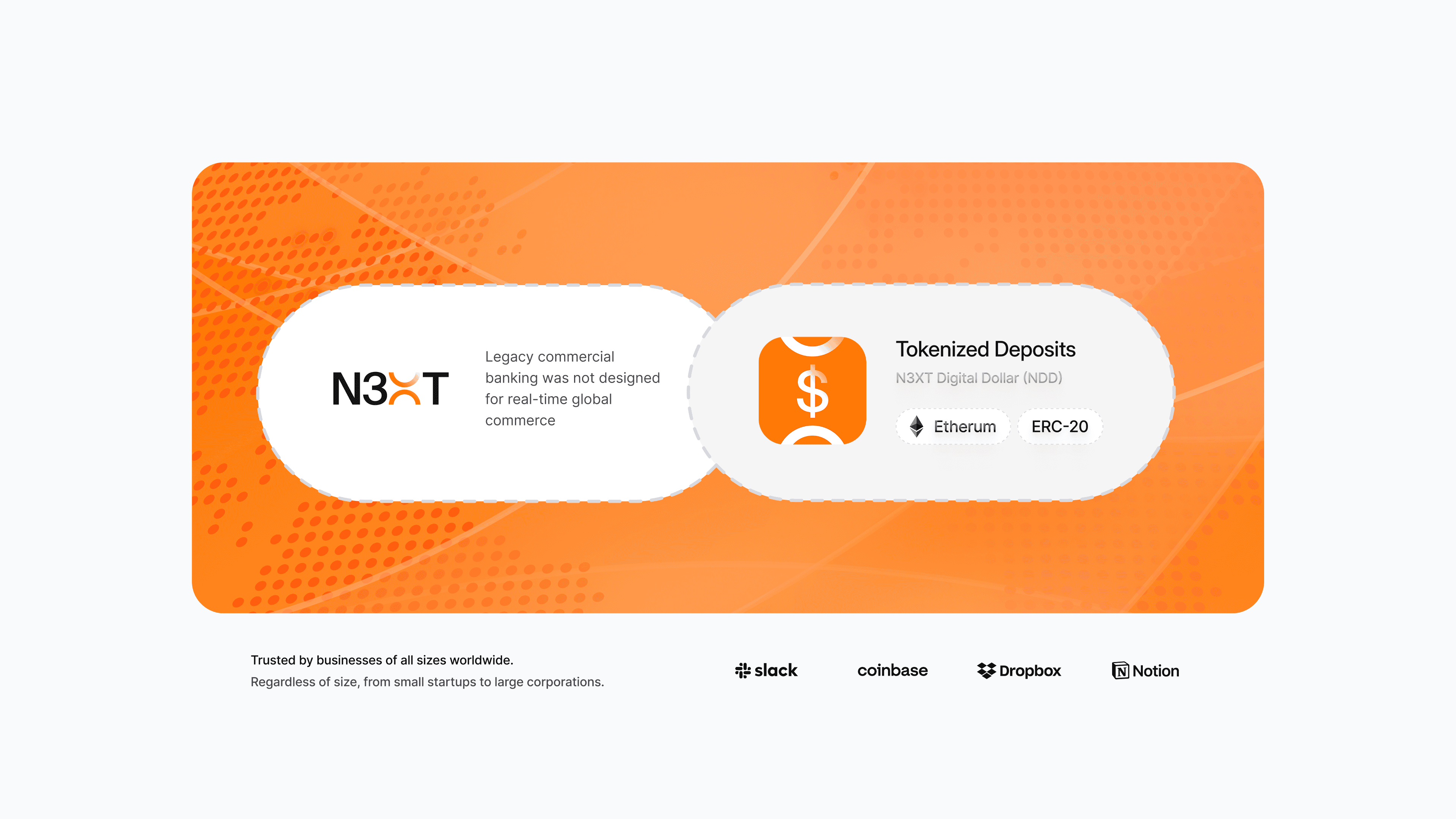
We extended the identity into the full launch kit, holding it consistent across every surface so a company stepping into the spotlight looked like one coherent thing from day one.
Pitch deck
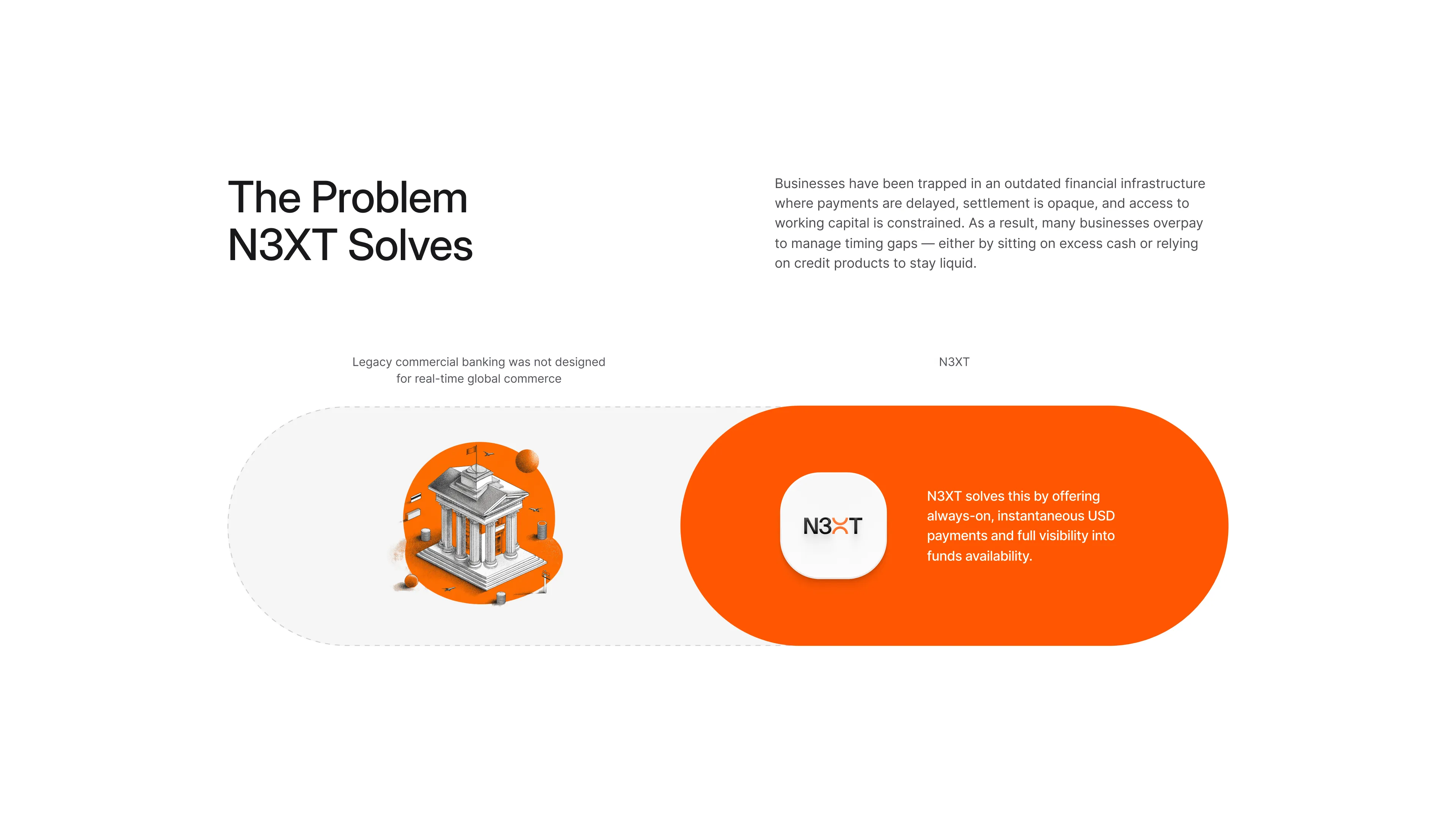
We took the same narrative spine from the brand work (hero, problem, guide, plan, the world that becomes possible) and compressed it into an investor deck built to win rooms, not just inform them.
Print collateral
Certainty about who you're paying and being paid by, removing the trust gap businesses currently paper over.
Launch film
To introduce N3XT to the world we made the brand anthem that opens the homepage: money set free, payments that simply arrive, an institution built to be trusted rather than endured. The three-second promise of the brand, given motion and emotion.

the result
$72M
Raised in Series A
Out of stealth
Fully launched brand, product, and site
18+ months
Partnership, still ongoing across brand, product, and web
Keep reading