How to Run a UX Audit in 5 Days, and What to Fix First

Adrian KuleszoCo-founder
Table of contents
- What a five-day audit can cover
- Before day one: scope, a number and access
- Day 1: kickoff and the numbers
- Days 1 to 3: walk every flow
- Days 3 to 4: rank what you found
- Days 4 to 5: prove one fix and walk the team through it
- What to fix first
- Common mistakes
- What it looked like for two of our clients
- Running one with us
- FAQs
A useful UX audit doesn’t need a month or a 90-slide report. Scope it to the flows that make you money, use the data you already have, rank every issue by severity and effort, and you can have a list your team can ship from in five working days.
This is the plan we run at DesignMe for SaaS products and marketing sites, and it works the same way for a B2B manufacturer’s quote form or a DTC checkout. Below is what happens each day, how to rank what you find, and the order we fix things in.
What a five-day audit can cover
Five days is enough for one product flow or a handful of website pages, reviewed properly. It isn’t enough for every screen in a mature product, and trying to cover everything is how audits turn into long reports nobody acts on.
Pick by money and by pain. For a product, that’s usually sign-up, onboarding and the first task people came for. For a marketing site, it’s the homepage, the pricing page and the demo or contact form. For a B2B manufacturer, it might be product search and the request-for-quote form, and for a DTC brand it’s the product page and checkout. If you need the whole product reviewed page by page with heatmaps and recordings, plan one to two weeks instead.
Before day one: scope, a number and access
Three things decide whether the week goes well, and all of them happen before the audit starts.
- One success metric. Trial starts, demo bookings, quote requests or completed orders. The audit is judged against it.
- The flows or pages in scope. Written down, with the reason each one is on the list.
- Access. The product or site, plus analytics, heatmaps or recordings if you have them. Read-only access is enough.
Name one person who can answer questions during the week, usually the founder, PM or marketing lead. A few messages a day saves the auditor from guessing, and guessing is where audits go wrong. If the brief is thin, our guide to briefing a design agency covers what to send.
- Before day one One success metric, the flows in scope, access.
- Day 1 Kickoff call, then the funnel, support tickets and sales notes.
- Days 1 to 3 Walk every flow on desktop and phone: heuristics, accessibility, speed.
- Days 3 to 4 Rank each finding by severity and effort.
- Days 4 to 5 Redesign one fix, record a walkthrough, agree what ships first.
Day 1: kickoff and the numbers
Start with a call on goals, the numbers that matter and the problems the team already suspects. Suspicions are useful: the audit either confirms them with evidence or rules them out.
Then read the data before forming opinions. Look at the funnel for each flow in scope, where people drop, which devices and browsers they use, and how far they scroll. Support tickets and sales call notes are often the richest source, because they record what confused real buyers in their own words.
Days 1 to 3: walk every flow
Walk each flow end to end, as a new user would, on desktop and on a phone. Review it against Jakob Nielsen’s 10 usability heuristics, such as visibility of system status, consistency and standards, and error prevention. In Nielsen’s own studies a single evaluator found only 35% of the usability problems, which is why Nielsen Norman Group recommends three to five evaluators reviewing independently. Even a small audit should have at least two people look at the same flow.
Most problems sit between screens rather than on them. A sign-up form can look fine and still ask for a phone number before the user has seen any value. That is why we audit the user flow and not a folder of screenshots.
Check accessibility as you go. WebAIM’s 2026 scan of the top million home pages found detectable WCAG 2 failures on 95.9% of them, with an average of 56.1 errors per page. Six issue types made up 96% of all errors: low contrast text (83.9% of pages), missing image alt text (53.1%), missing form labels (51%), empty links (46.3%), empty buttons (30.6%) and a missing page language (13.5%). Each one takes minutes to spot. If you sell into the EU, the European Accessibility Act has applied to e-commerce, consumer banking and other covered services since 28 June 2025, with an exemption for service providers under 10 staff and €2 million turnover, so for most of those teams this part is no longer optional.
Record speed too. Google’s Core Web Vitals call a page good when the largest content loads within 2.5 seconds, the page responds to input within 200 milliseconds and the layout shift score stays under 0.1, measured at the 75th percentile of real visits.
Days 3 to 4: rank what you found
An unranked list doesn’t get fixed. Give every finding evidence, a severity, an effort and a recommended fix.
For severity, use the three factors Jakob Nielsen set out in 1994: frequency (how many people hit it), impact (how hard it is to get past) and persistence (whether it bothers people once or every time). His 0 to 4 scale runs from “not a problem” to a usability catastrophe that has to be fixed before release. For effort, low, medium and high is enough.
Here is what a ranked list looks like. These rows are an example, not from a client.
| Finding | Where | Severity | Effort | Recommended fix |
|---|---|---|---|---|
| Free trial hidden below three plan tables | Pricing page | High | Low | Lead with the trial, move plan details under it |
| Sign-up asks for company size and phone first | Sign-up | High | Medium | Ask after the first win in the product |
| Empty dashboard gives no next step | First session | High | Medium | Sample data and one guided task |
| Date field opens the wrong keyboard on mobile | Demo form | Medium | Low | Use a native date input |
| No visible focus state on the main navigation | Sitewide | Medium | Low | Add focus styles to the nav component |
Sorted this way, high-severity and low-effort items become the first sprint, high-severity and high-effort items become the next project, and low-severity items wait.
Days 4 to 5: prove one fix and walk the team through it
Redesign the most important fix rather than describing it. A redesigned pricing section or sign-up step settles arguments a written recommendation can’t, and it gives engineers something concrete to estimate.
Finish with a recorded walkthrough and a call to agree what ships first. A short video means the whole team hears the same story, including the people who missed the meeting.
What to fix first
Our default order, once the list is ranked:
- Blockers in the money path. Anything that stops someone signing up, booking a demo, requesting a quote or paying. Baymard Institute puts the average documented cart abandonment rate at 70.22%, and in its US survey 18% of shoppers abandoned because they had to create an account and 17% because checkout was too long or complicated. The same logic applies to B2B forms that ask for too much too early.
- Accessibility basics. Contrast, labels, alt text and focus states. They are usually low effort and help every user.
- The message above the fold. If visitors can’t tell what you sell and who it’s for in a few seconds, every other fix works harder than it should.
- Speed on a phone. Heavy images, scripts and layout shifts, measured against Core Web Vitals.
- Consistency. Five button styles and three ways to do the same thing slow users and your team. This is often the start of a design system project.
Common mistakes
- Opinions without evidence. “The hero feels weak” isn’t a finding. Tie each issue to data or a heuristic.
- Auditing everything at once. Breadth kills the ranking. Two flows done well beat twenty done lightly.
- Skipping the phone. Many audits are done on a large monitor, while a large share of visits arrive on mobile.
- Treating the audit as user research. An audit can’t replace watching real people use the product. A good one ends with a short list of questions worth testing.
What it looked like for two of our clients
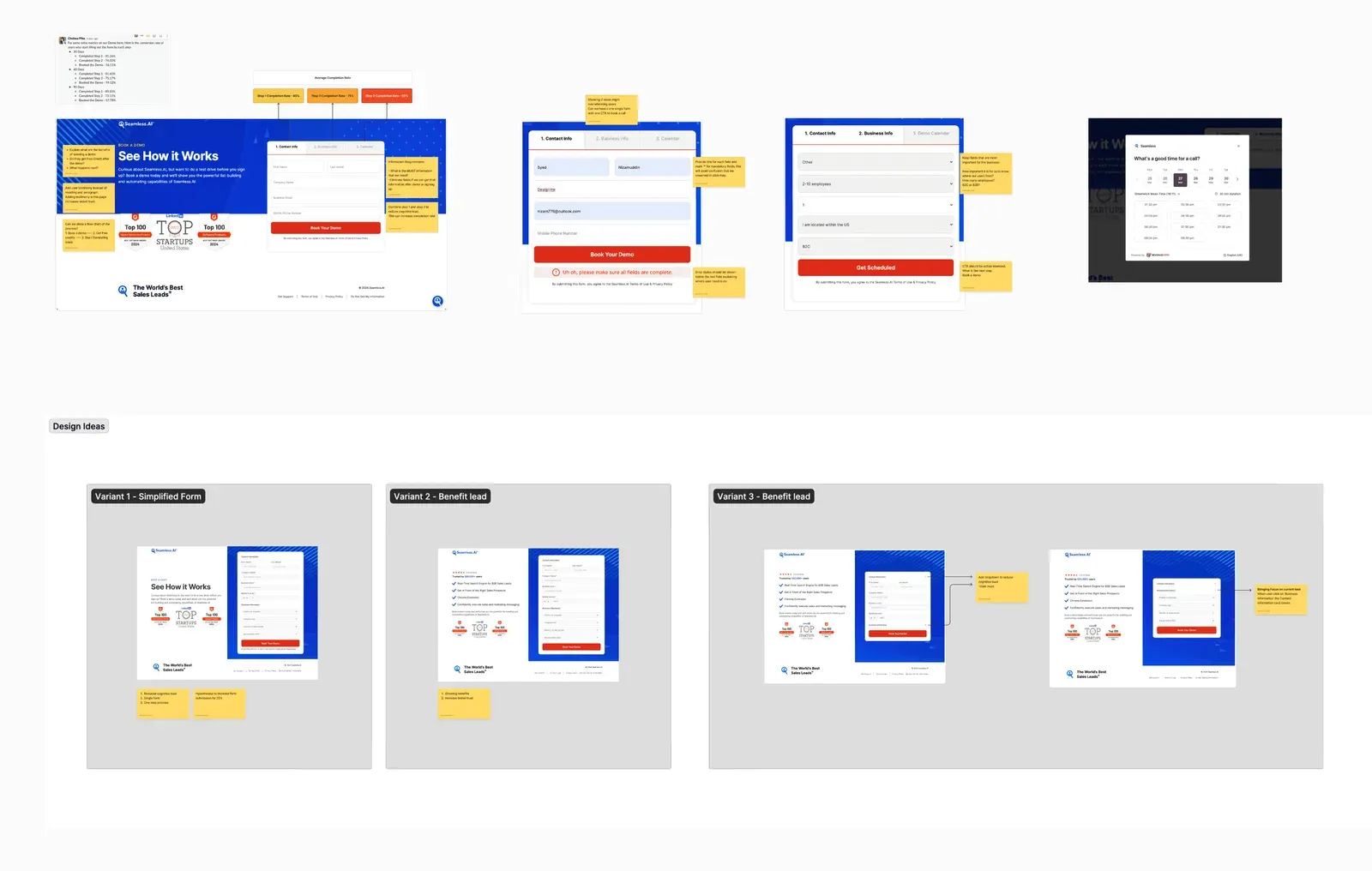
Seamless.AI started with a three-day audit sprint on the landing page and brand, which ended in one recommendation: a refreshed hero. A deeper audit followed with their CRO and growth team, and it showed that only about 5% of homepage visitors gave an email and clicked the main CTA. The redesign that followed was A/B tested page by page, and the demo page alone lifted bookings 30%.
Ballogy, an athlete development app with 300K+ users, also started with an audit. The issues were a long onboarding people dropped out of and parents set up as a copy of the player. It grew into a redesign of every flow and then a rebuild of the iOS and Android frontend.
Running one with us
Our UX audit sprint is $2,500 and takes 3 to 5 days. You get ranked findings, annotated screens, one piece redesigned as proof, a recorded walkthrough and the Figma file, and the fee is credited to any package if you continue. A deep audit with heatmaps and recordings takes one to two weeks and is priced on request. Many teams ship the quick wins themselves and bring us in for the bigger changes through product design or conversion optimisation.
If your site also needs to show up in AI answers, run it through our free AEO checker before the audit, so the findings cover both.
DesignMe audits and redesigns products and websites for funded SaaS and AI companies, and for B2B teams whose site has to sell something complicated. If you know where people drop off but not why, send us the flow and we’ll reply within one business day:
Sources
- Nielsen Norman Group, "10 Usability Heuristics for User Interface Design" (opens in a new tab)nngroup.com
- Nielsen Norman Group, "How to Conduct a Heuristic Evaluation" (25 June 2023) (opens in a new tab)nngroup.com
- Jakob Nielsen, "Characteristics of Usability Problems Found by Heuristic Evaluation", Nielsen Norman Group (1 November 1994) (opens in a new tab)nngroup.com
- Jakob Nielsen, "Severity Ratings for Usability Problems", Nielsen Norman Group (1 November 1994) (opens in a new tab)nngroup.com
- WebAIM, "The WebAIM Million" (February 2026) (opens in a new tab)webaim.org
- W3C, Web Content Accessibility Guidelines (WCAG) 2.2 (opens in a new tab)w3.org
- Directive (EU) 2019/882, the European Accessibility Act (opens in a new tab)eur-lex.europa.eu
- Google, web.dev, "Web Vitals" (opens in a new tab)web.dev
- Baymard Institute, "Cart Abandonment Rate Statistics" (updated 22 September 2025) (opens in a new tab)baymard.com
Press Escape to close.