Overview
Website pages and explainers for a scheduler built for sales closers
iClosed qualifies leads before they book a sales call. We designed and built its website and animated the explainers that show how.
- Page types, from the homepage to booking
- 6
- Explainers: old way against new way
- 3
- Book-a-call layouts explored in design
- 5
Services used
About the project
iClosed is a scheduler for high-ticket sales teams. It captures the lead before it shows the calendar, filters out people who won’t buy and routes the rest to the right closer.
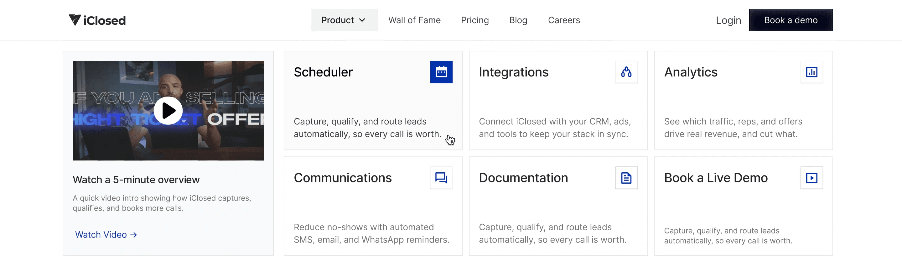
From late 2024 to early 2025 we designed and built its website: the homepage, product pages for the AI Scheduler and Analytics, pricing, a book-a-call page, a wall of fame and the navigation. We designed it in Figma, built it in Framer and storyboarded and animated three explainers in Jitter.
iClosed’s team has changed the live site since. The stills on this page are our Figma designs and the animations are recordings of the site as we delivered it, not iclosed.io today. Pricing is the exception: the live page is still close to our design, so it is shown live.
- Client
- iClosed
- Industry
- B2B sales software
- Services
- Website design · Framer build · Explainer animations and storyboards
- Timeline
- Late 2024 to early 2025
Hero and style inspirations for the new iClosed design
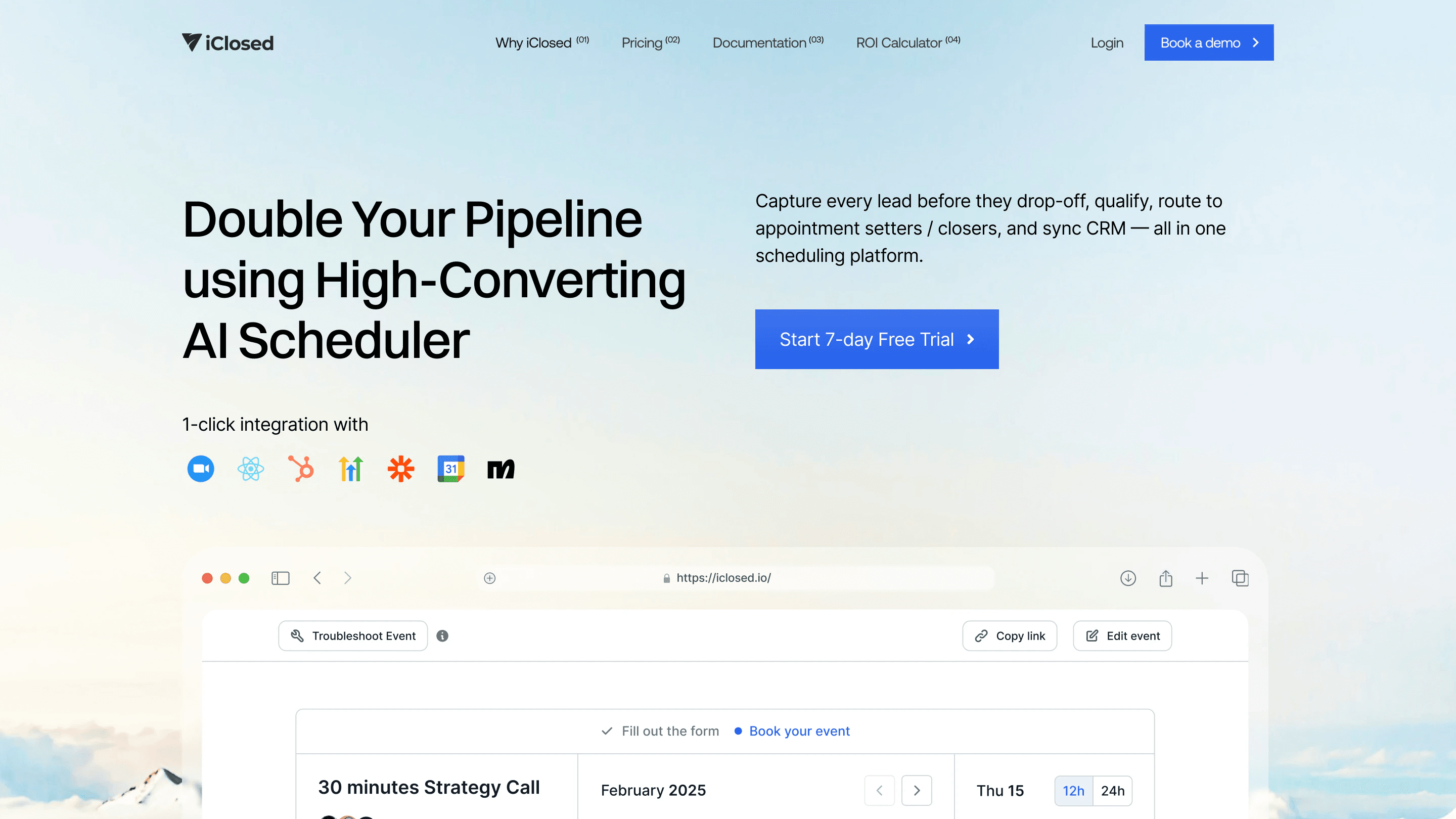
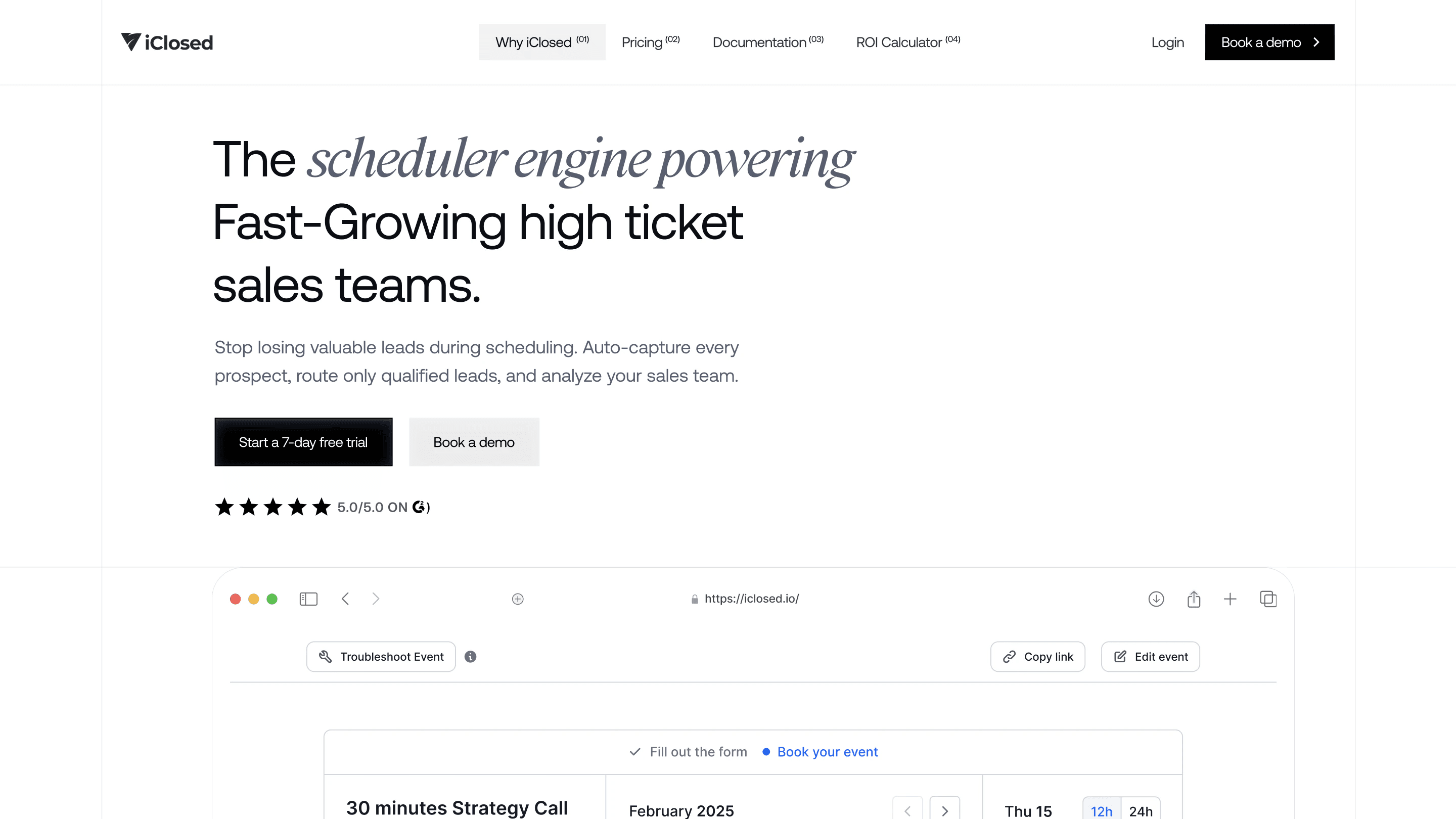
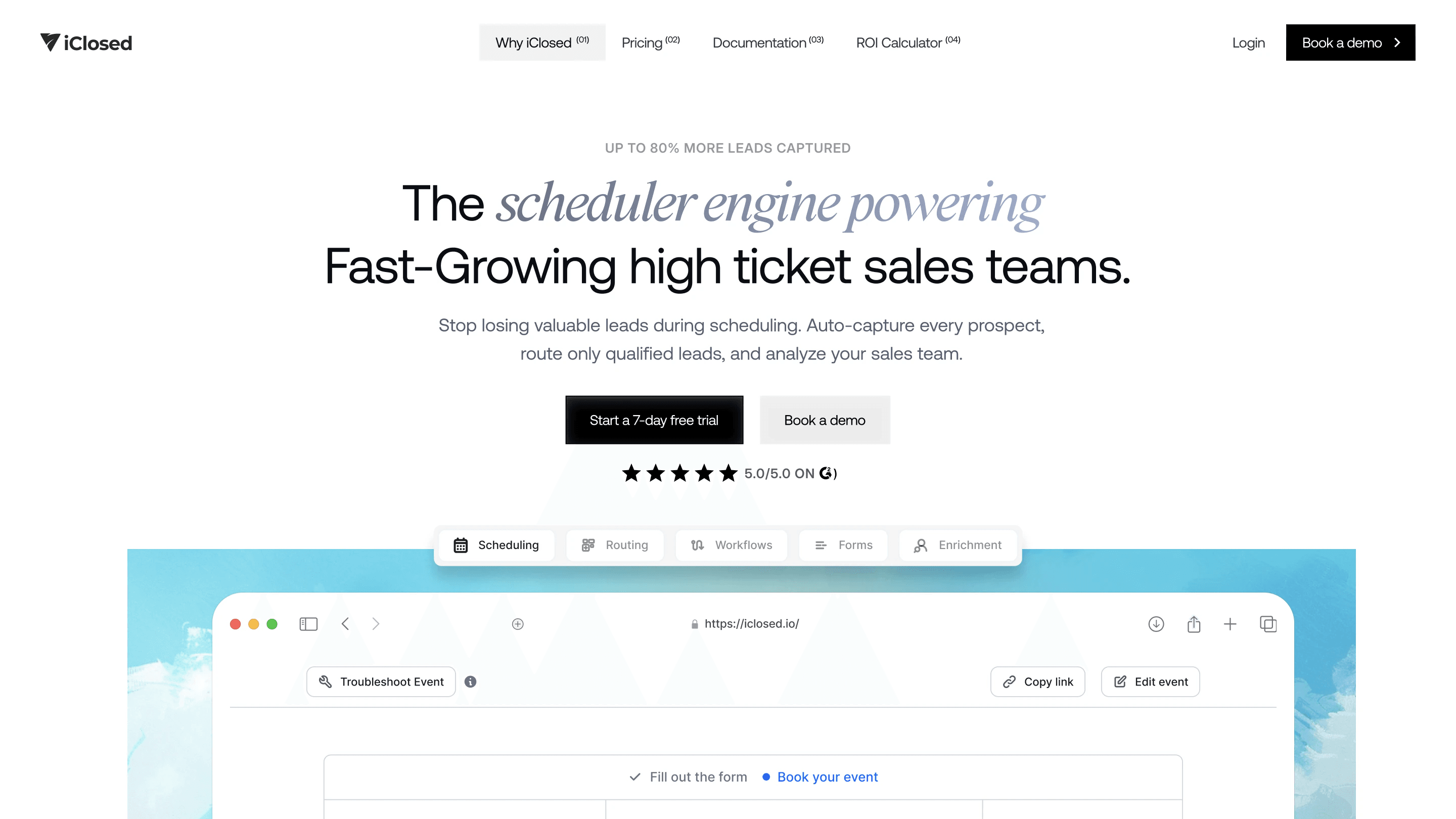
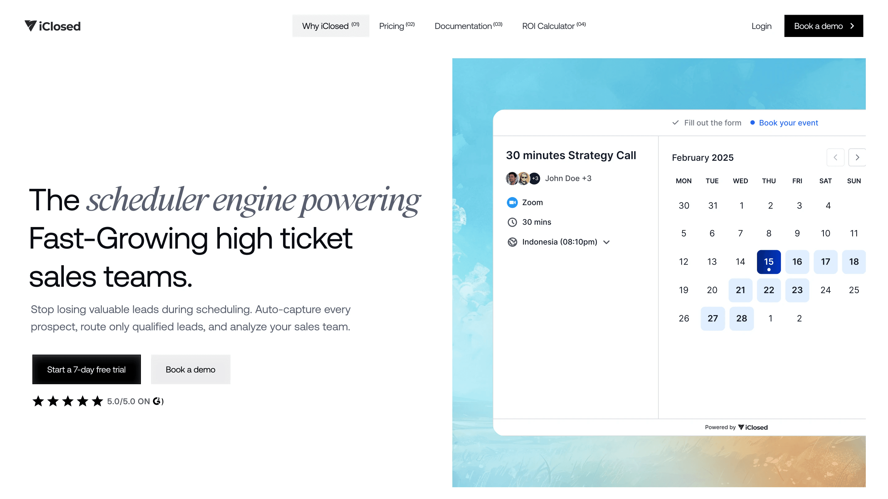
The homepage as we built it
The challenge
From the outside, every scheduler looks like a calendar link. iClosed’s buyers run sales teams and judge tools by show-up and close rates, so the site had to show what happens before the calendar, not just the calendar.
- A crowded category
- Most buyers already use a free booking link and need a reason to switch in the first screen.
- A product you have to see working
- Lead capture, qualification and routing only make sense when you watch a booking happen.
- Buyers who read numbers
- Setters, closers and sales managers want the outcome in plain terms, not adjectives.
- Many pages, one system
- Product, analytics, pricing and booking pages had to be built from the same parts.
Explainers
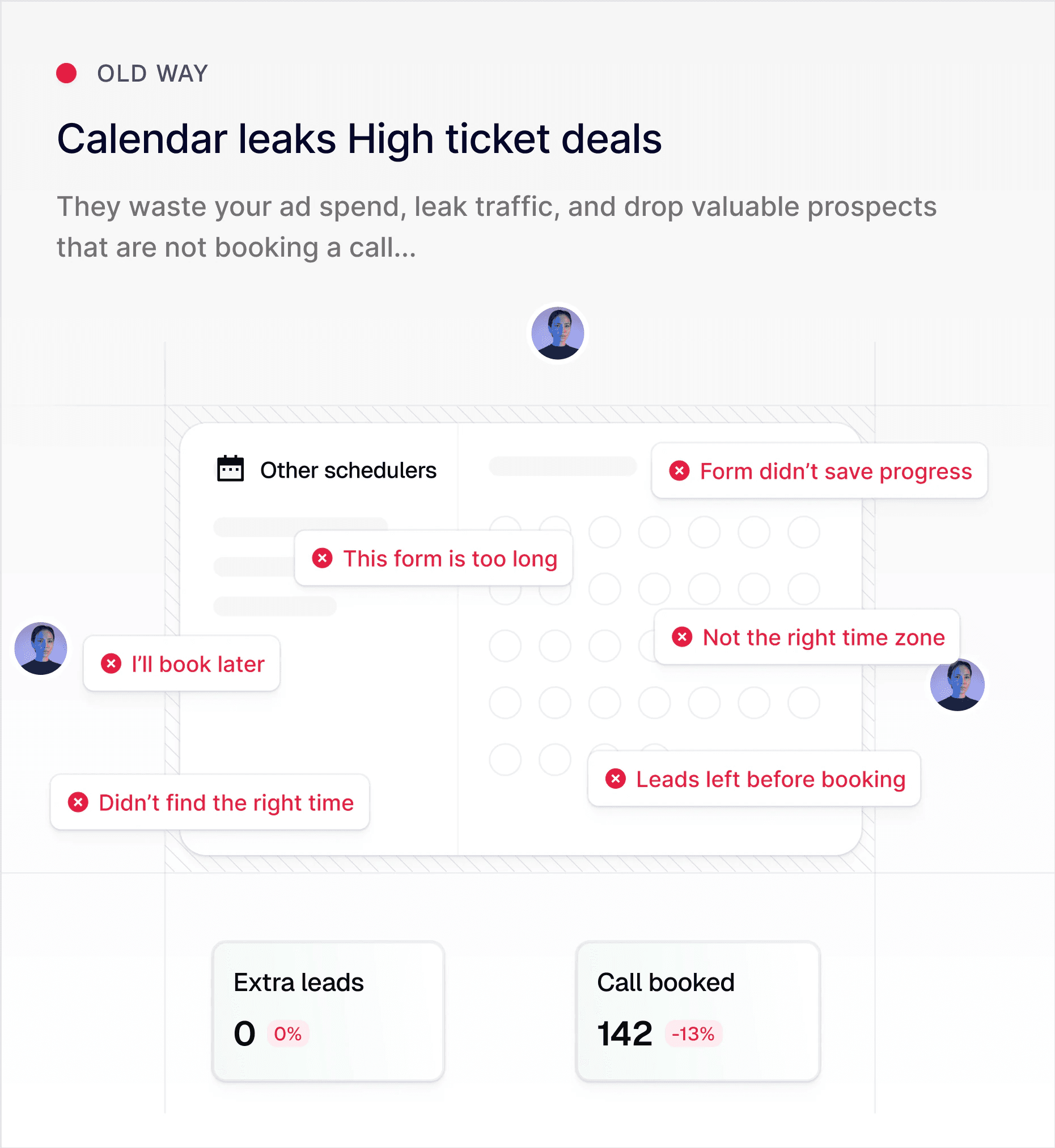
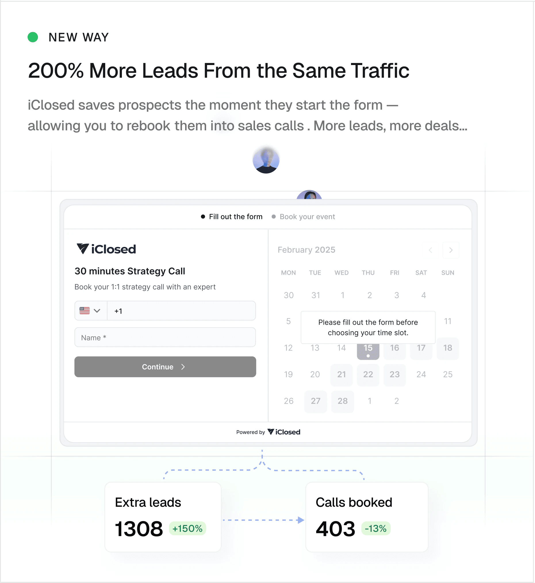
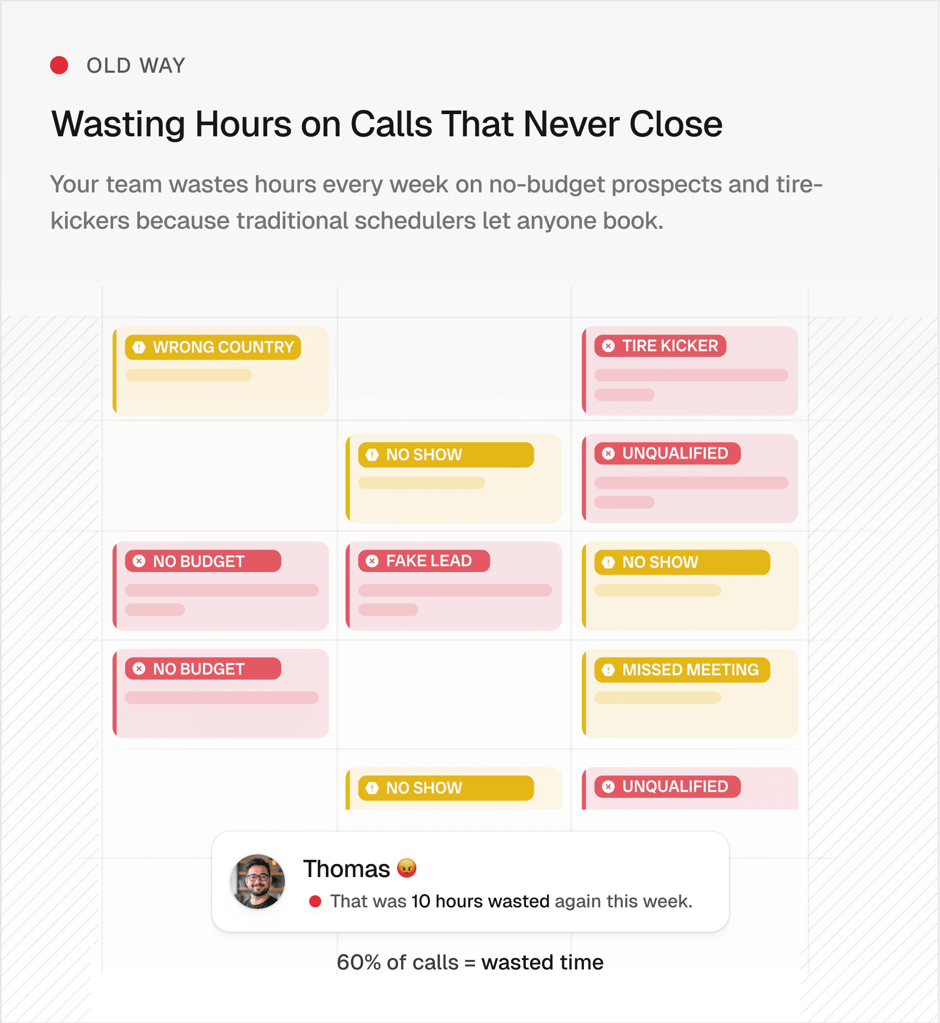
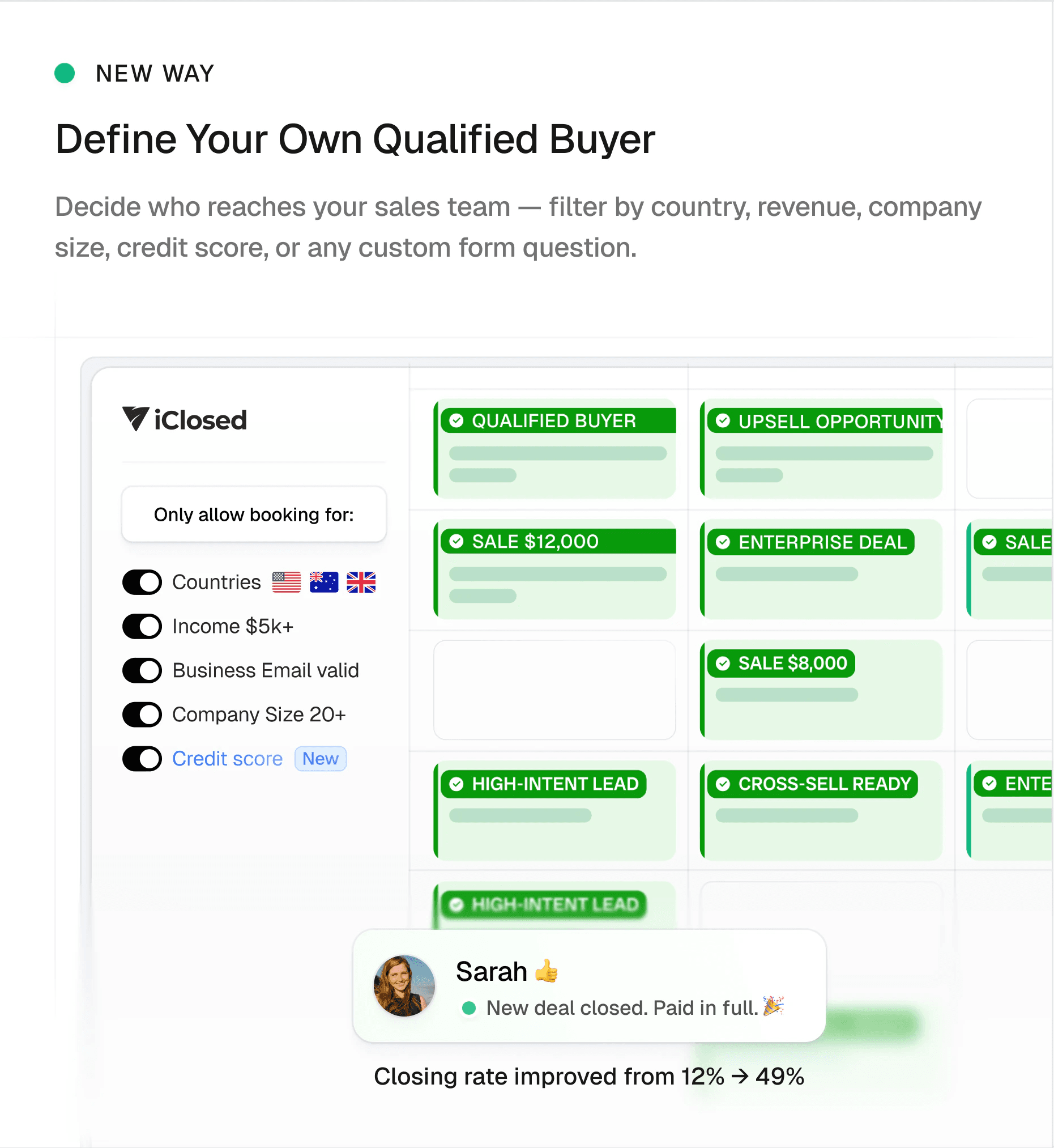
Each explainer runs two panels side by side: the old way on the left and the same moment in iClosed on the right, for lead generation, lead qualification and sales tracking.
These are the final animations as we delivered them. The figures inside them are iClosed’s own product claims.
Storyboards
We storyboarded every explainer frame by frame in Figma, then animated them from those boards, so the motion follows a script: the problem builds up on the left, then the iClosed panel answers it.
Product pages
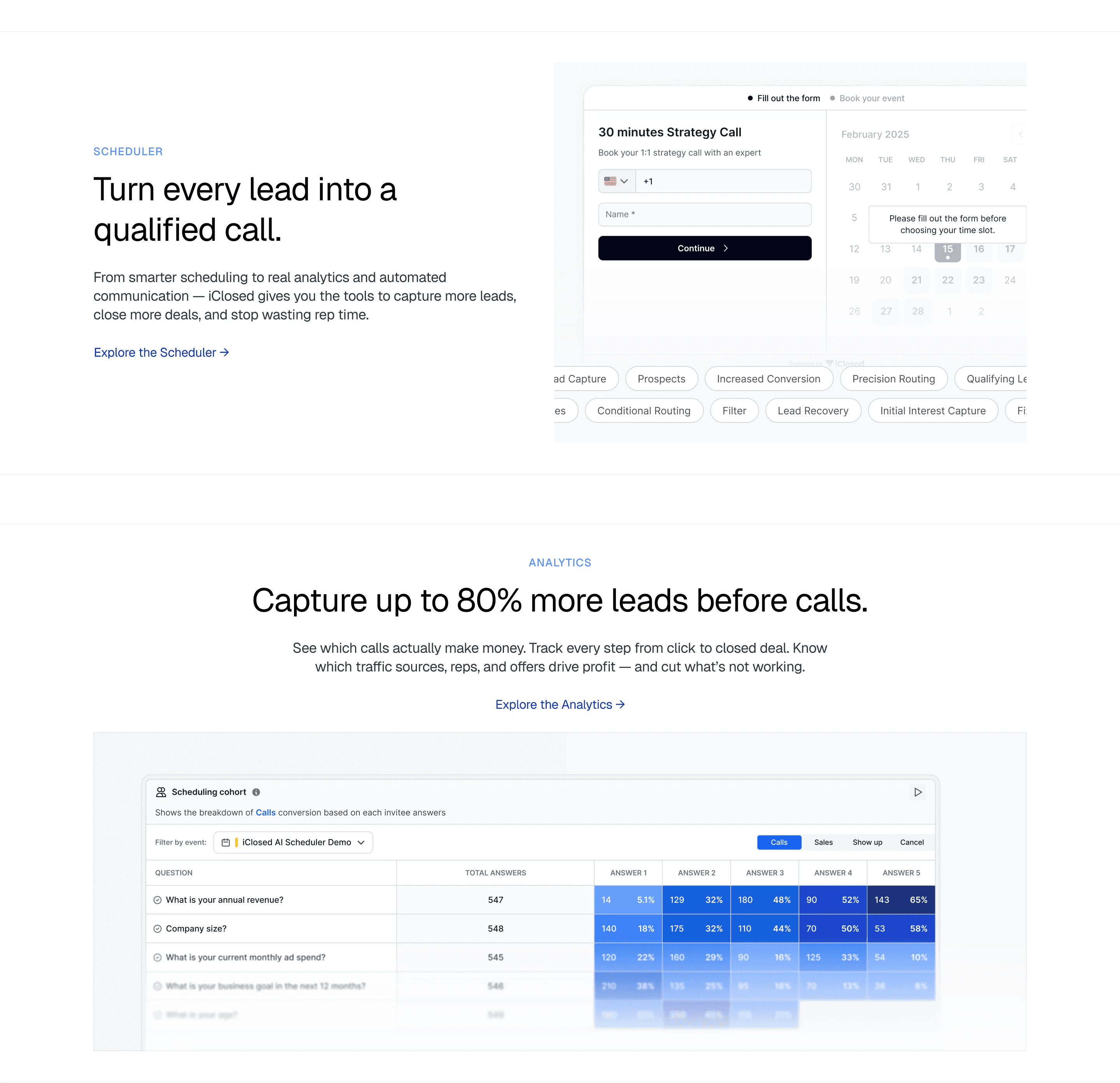
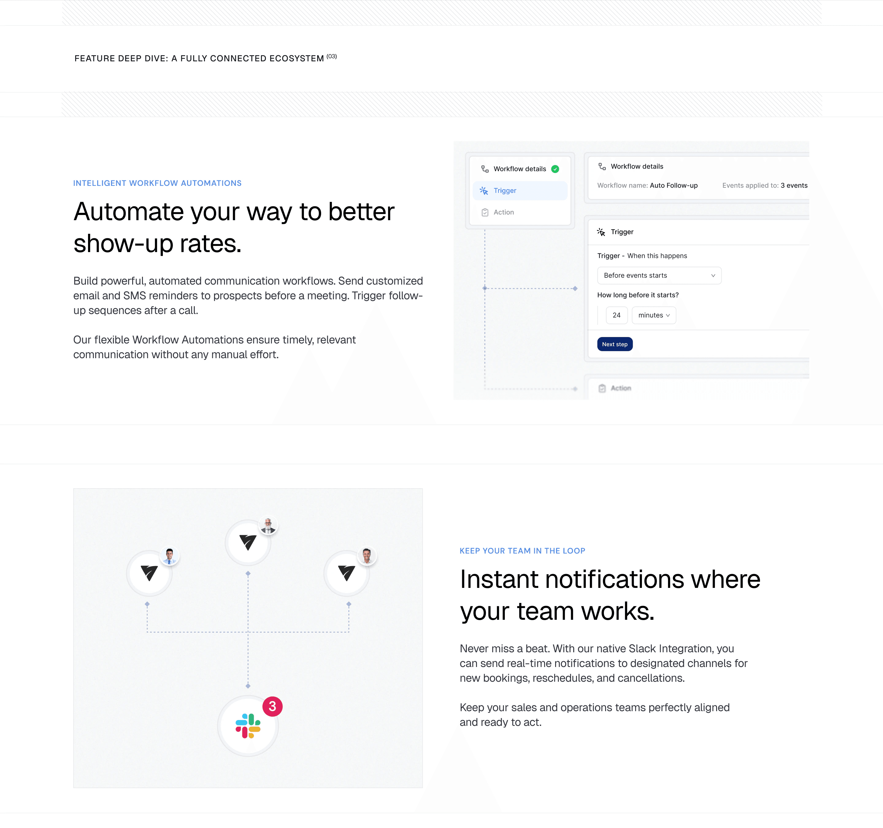
The AI Scheduler and Analytics pages go one level deeper. Every feature gets a small mock of the product instead of a stock illustration, so a sales manager can see what it does at a glance.
- One mock per feature
- Reminders, anti-spam and freeing unconfirmed slots each show the screen that does the job.
- Every message mapped
- Communications shows the email, SMS and Slack messages each booking, reschedule and cancellation sends.
- Data up front
- Analytics leads with the numbers, starting with the scheduling cohort table on the homepage.
Pricing and booking
Pricing sets the plans side by side with the most popular one marked, then a full comparison table under them. iClosed’s live pricing page is still close to our design, so the recording below is the live page.
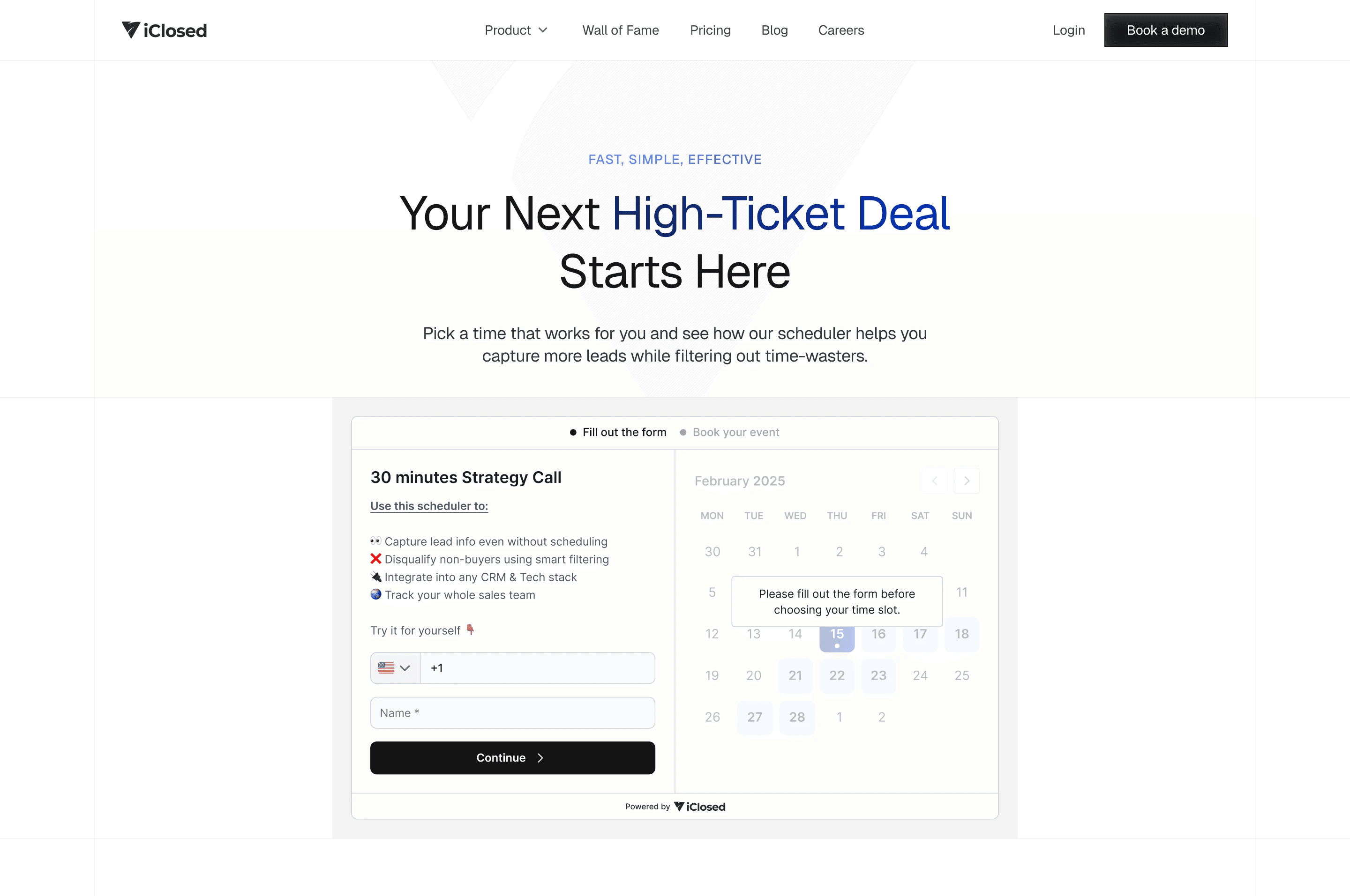
The book-a-call page runs on iClosed’s own scheduler, so booking a demo is also the first look at the product. Every page ends with a clear next step: a free trial, a demo or a one-to-one onboarding call with iClosed’s team.
Keep reading
More case studies
- Designed the brand and digital experience for a $72M-funded next-gen narrow bank platform.
- Refreshing the brand, the product and the website experience behind Lightdash’s $11M Series A
- Redesigning and rebuilding the mobile experience for an AI-powered athlete development app with 300K+ users.





- Helping a 1M+ user sales platform improve website engagement and conversion rates.
You've reached the end, so now…
Tell us what you’re building.
We’ll help you map the right scope, team, timeline, and next steps.
Book a call