Overview
Redesigning Workamajig without losing what its agencies already know
Workamajig has sold software to creative agencies since 1986. We redesigned the product around what its users know, and now the website.
- When the company behind Workamajig started selling to creative firms
- 1986
- Roles with redesigned screens, from creatives to billing
- 6
- Versions of the calendar in the first rounds
- 5
What we did
About the project
Workamajig is all-in-one software for advertising and marketing agencies: projects, timesheets, resourcing, sales, billing and purchasing in one place.
The company has sold project management software to creative firms since 1986, and the product has carried the Workamajig name since 2008. We started with the product: a new interface for the screens agency teams open every day. The website comes next, and that work is under way now.
- Client
- Workamajig
- Industry
- Agency management software, B2B SaaS
- Services
- Product design · UI redesign · Design system · Website design
- Timeline
- 2025 to now, ongoing
The challenge
Workamajig isn't a new product looking for users. Thousands of agencies already know where everything is, so the redesign had to keep what people recognize and still feel new.
- Keep what people know
- Roles, the Today page, project numbers and the way work is filed stay where users expect them.
- Make it feel new
- A lighter interface, calmer tables, and color only where it carries meaning: status, priority and progress.
- One look, many roles
- Creatives, salespeople, project managers and billing each start from their own view, in the same system.
- Dense screens, calm reading
- Gantt charts, timesheets and staff schedules are full of rows and hours. They had to stay readable at a glance, on a full working day.
So the redesign is a UI upgrade of each screen, not a new product. The structure people rely on stays, and almost everything they look at changes: type, spacing, color, navigation and the parts every screen is built from.
Before and after
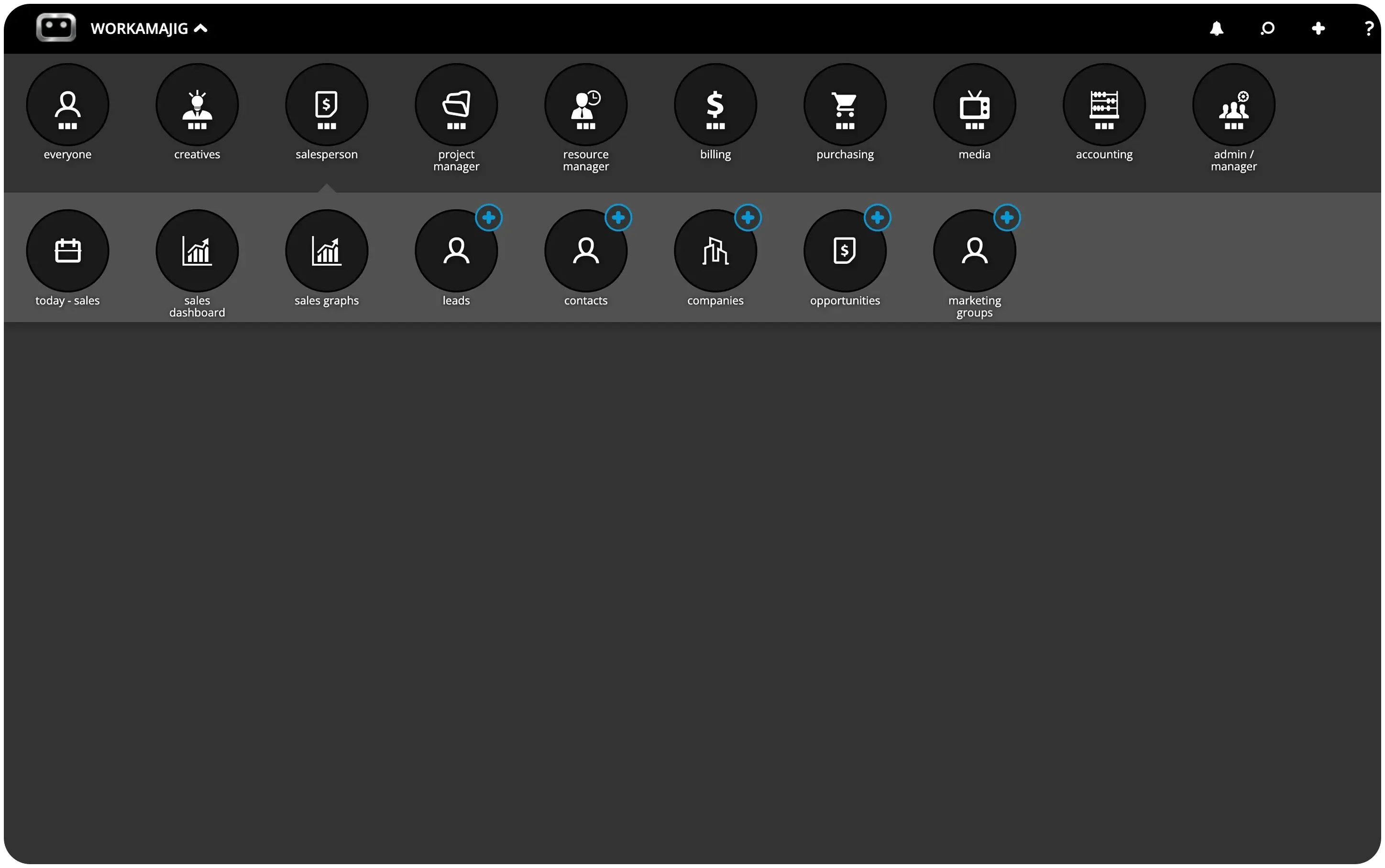
The old app opens on a dark launcher: a round icon for every role, and a second row with that role's tools.
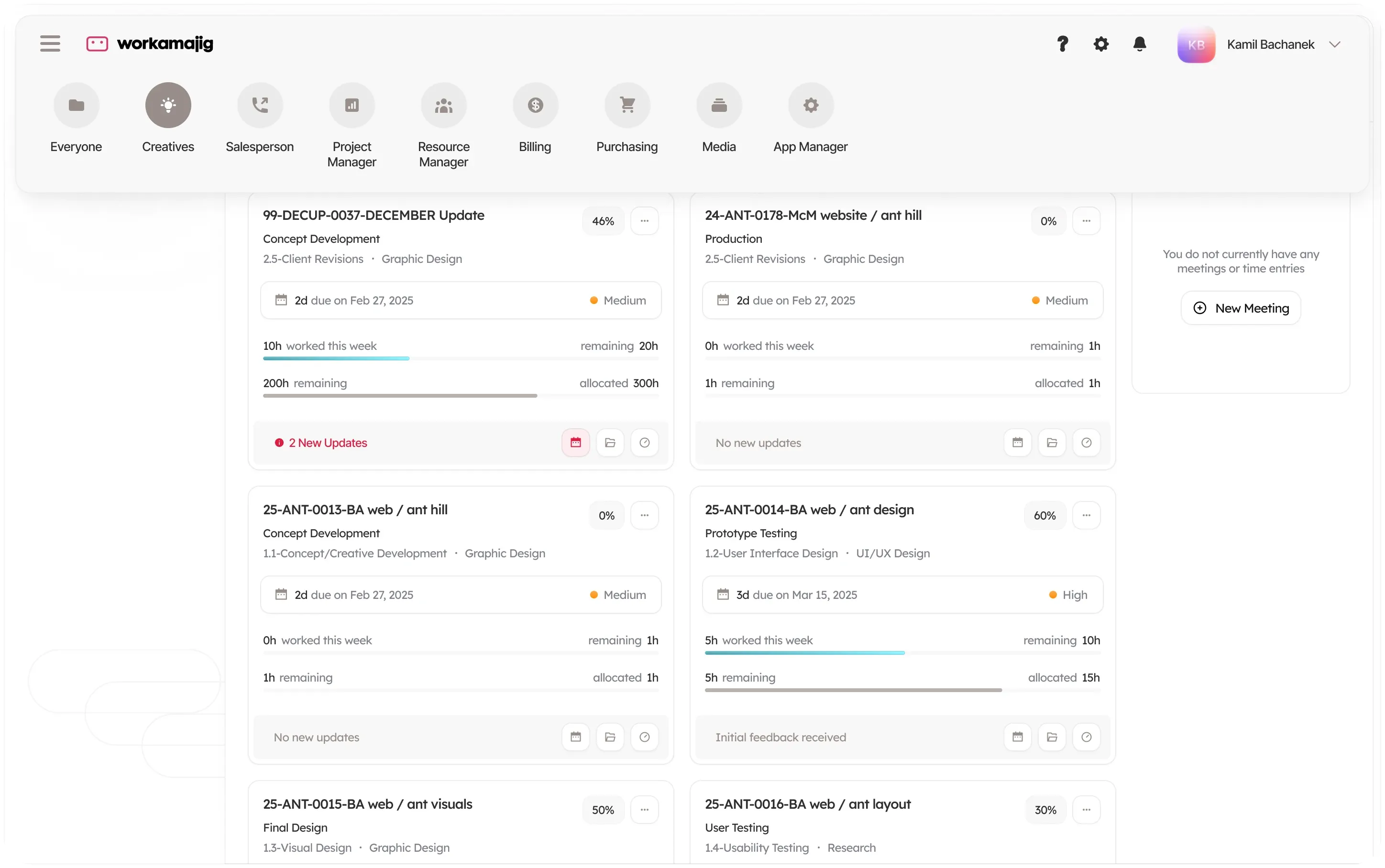
We kept the idea of one menu per role, so nobody has to relearn where their work lives, and moved it into a light top bar that opens over the page they are on.
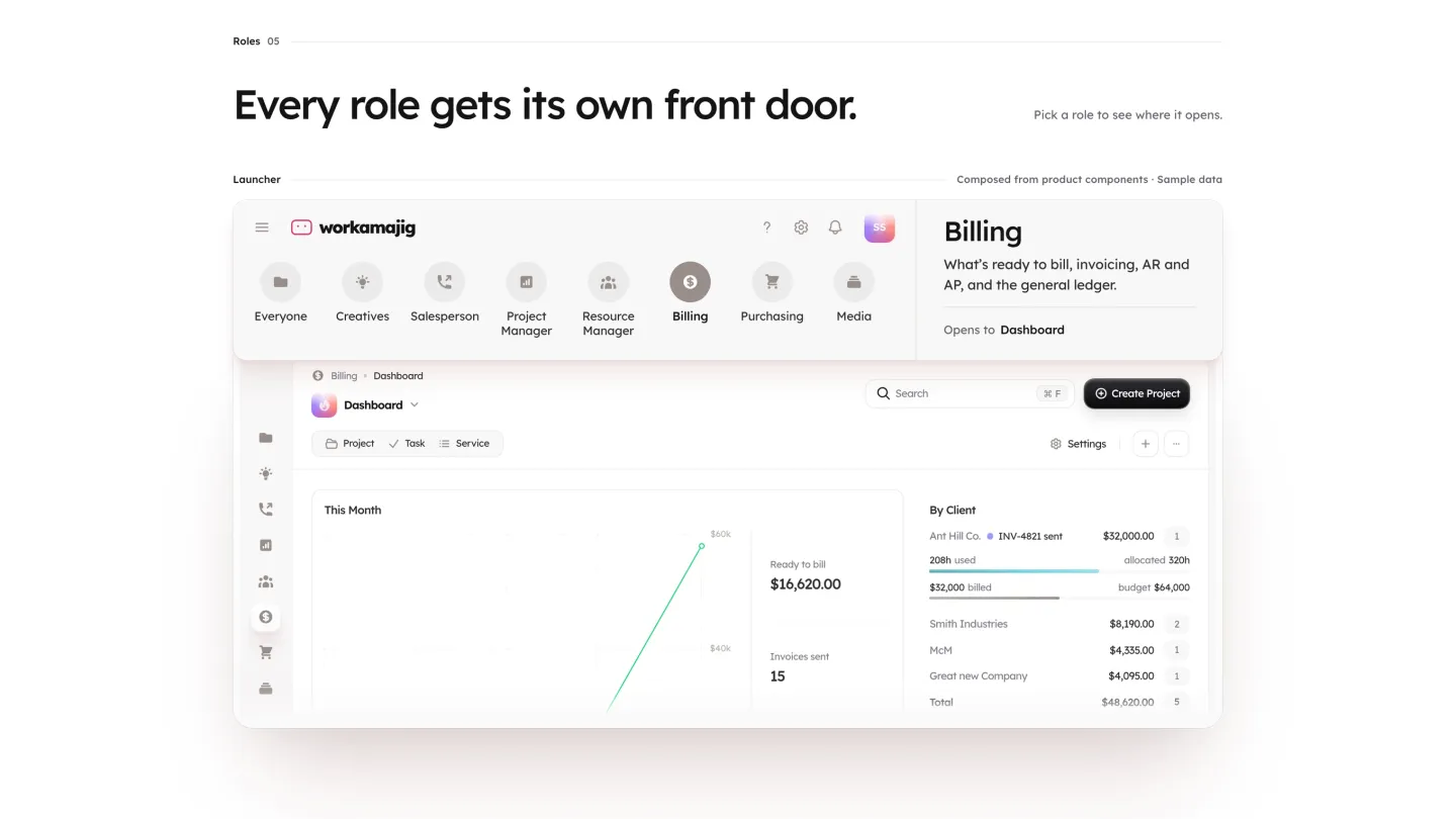
The new menu still lists every role, Everyone, Creatives, Salesperson, Project Manager, Resource Manager, Billing, Purchasing and Media among them, so a long-time user still starts the day the way they always have: by picking their role.
Getting around
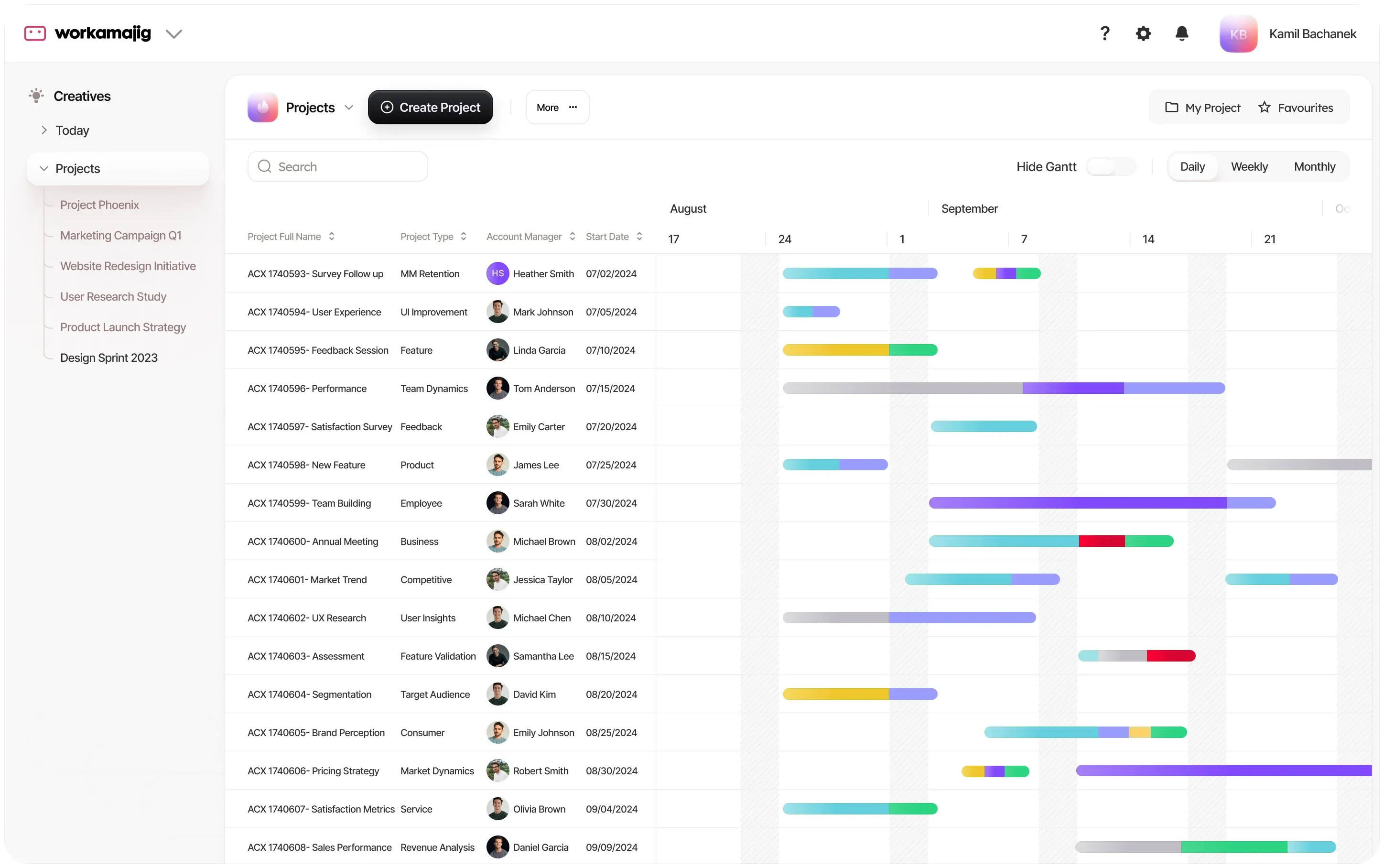
Navigation took the most rounds. We tried a slim icon rail, a sidebar with folders, a menu that drops down from the top bar and role tabs along the top, each on the same screens.
The first round put every role in a rail on the left. The latest keeps the current role's pages in the sidebar and moves the switch between roles to the top of the screen.
In 2026 the navigation bar alone went through four versions, followed by more rounds laid over the same five screens, so the team could compare them side by side instead of in the abstract. The sidebar now names the role at the top and lists its pages as folders that open in place: for Everyone that is the timesheet, calendars, expense reports, the report center, tracking forms and notes.
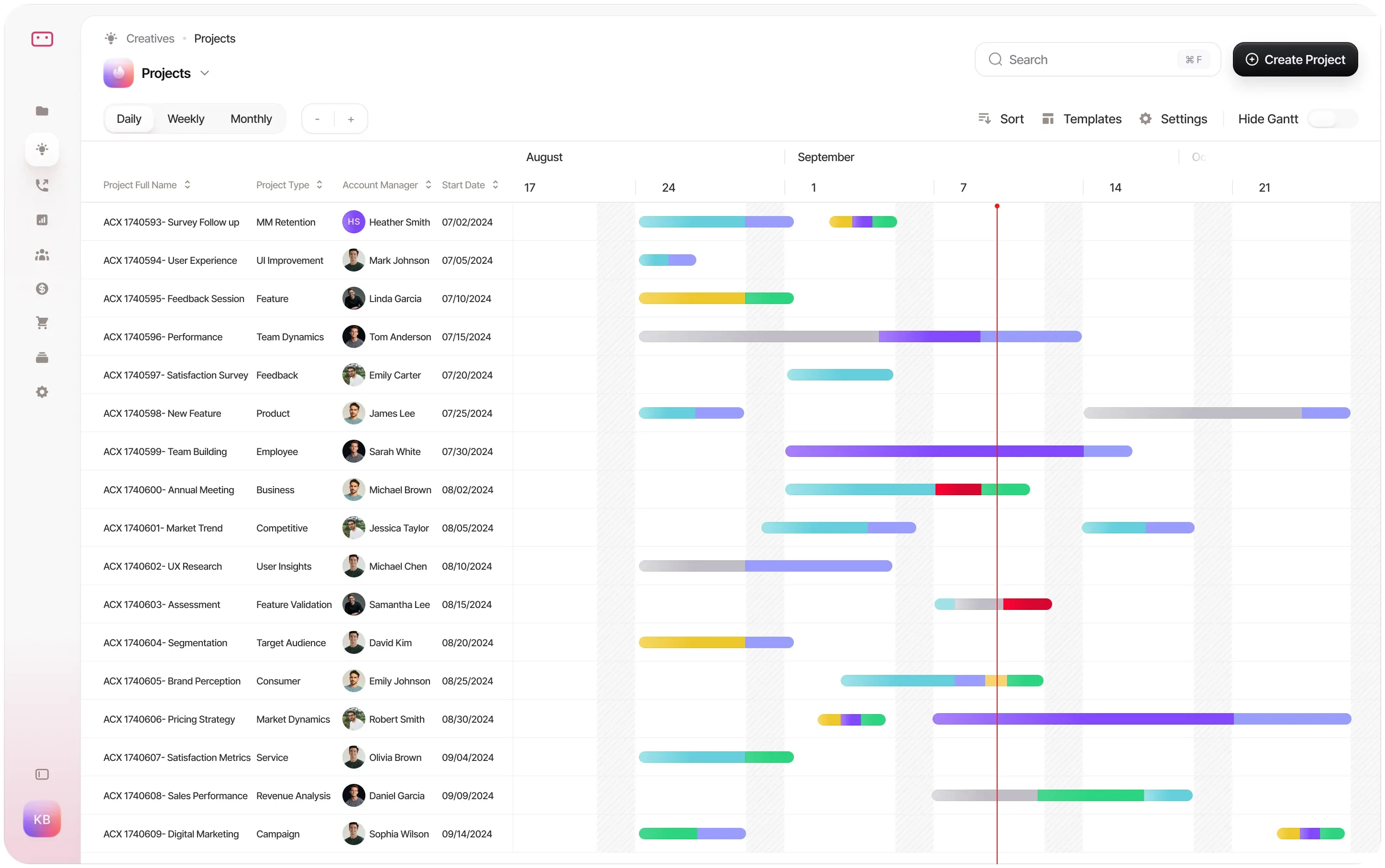
Another version: role tabs along the top
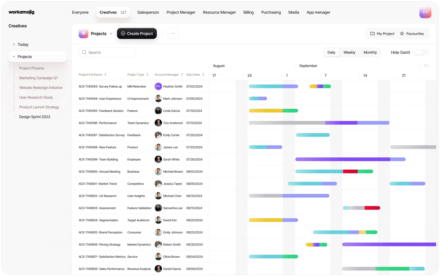
One look, many roles
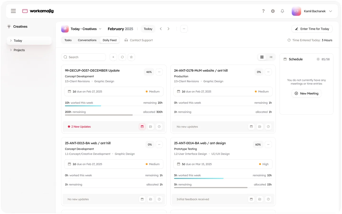
Every role starts its day on a Today page. For creatives it is a board of tasks, each card showing hours worked, hours left and any new updates.
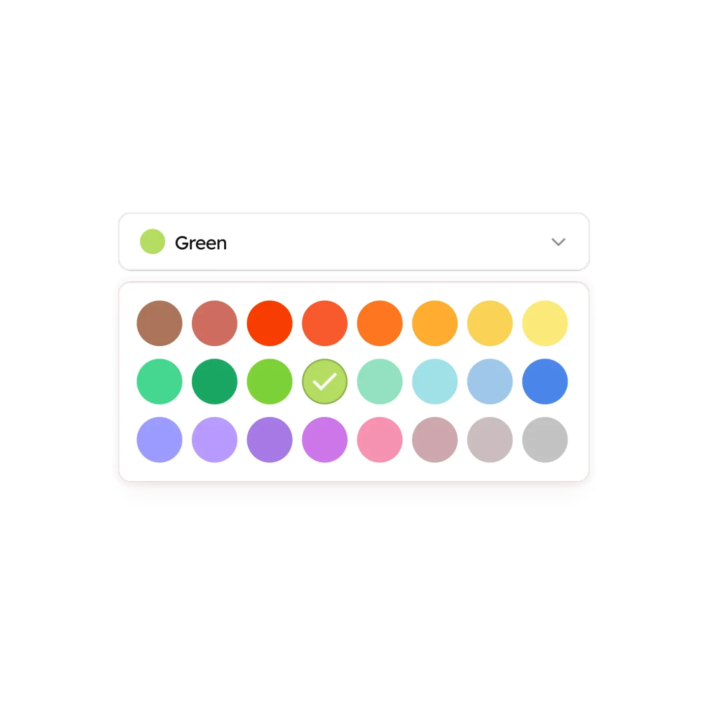
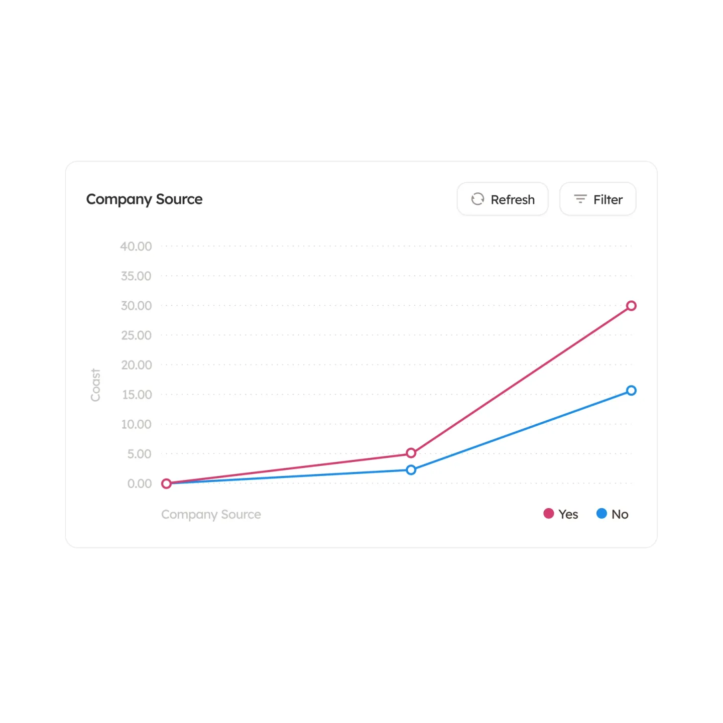
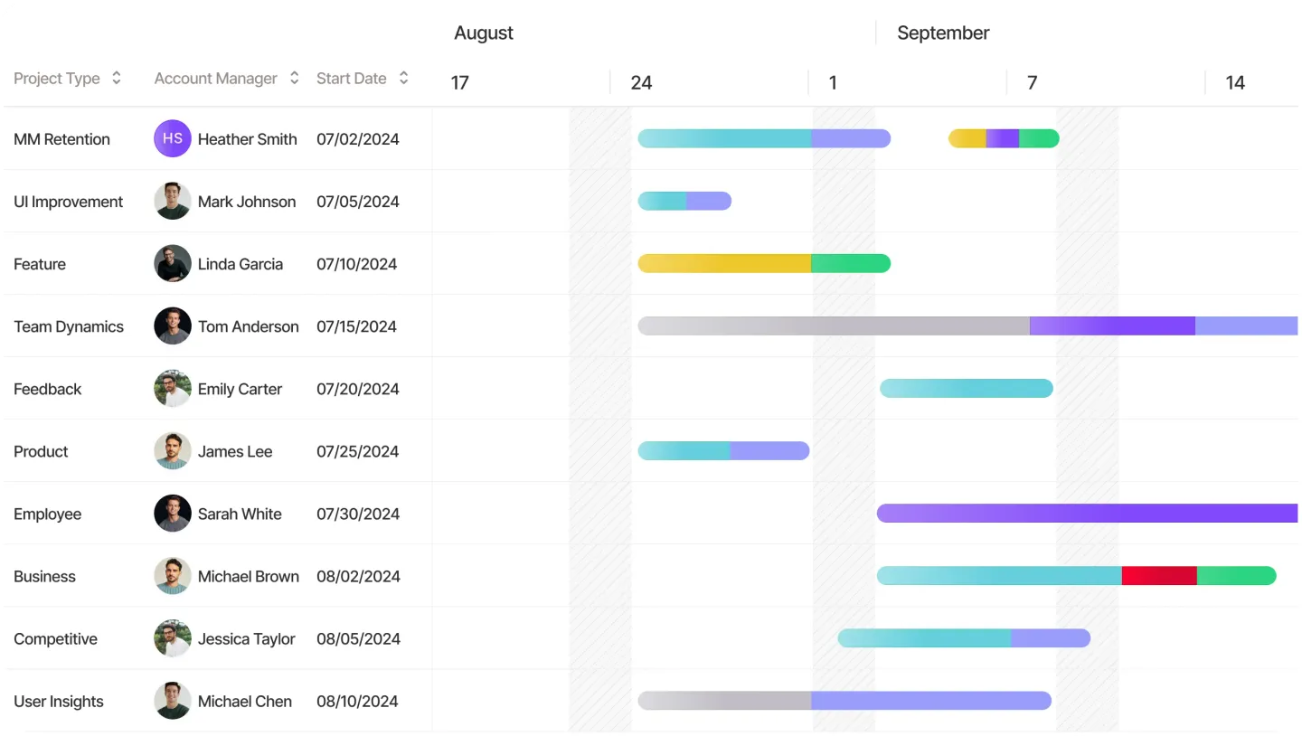
The same parts build every role's screens: cards, pickers, charts and tables. The look stays light and calm, white cards on soft grey with thin borders, and the small details carry the work: a priority tag, hours worked against hours left, a red count of new updates.
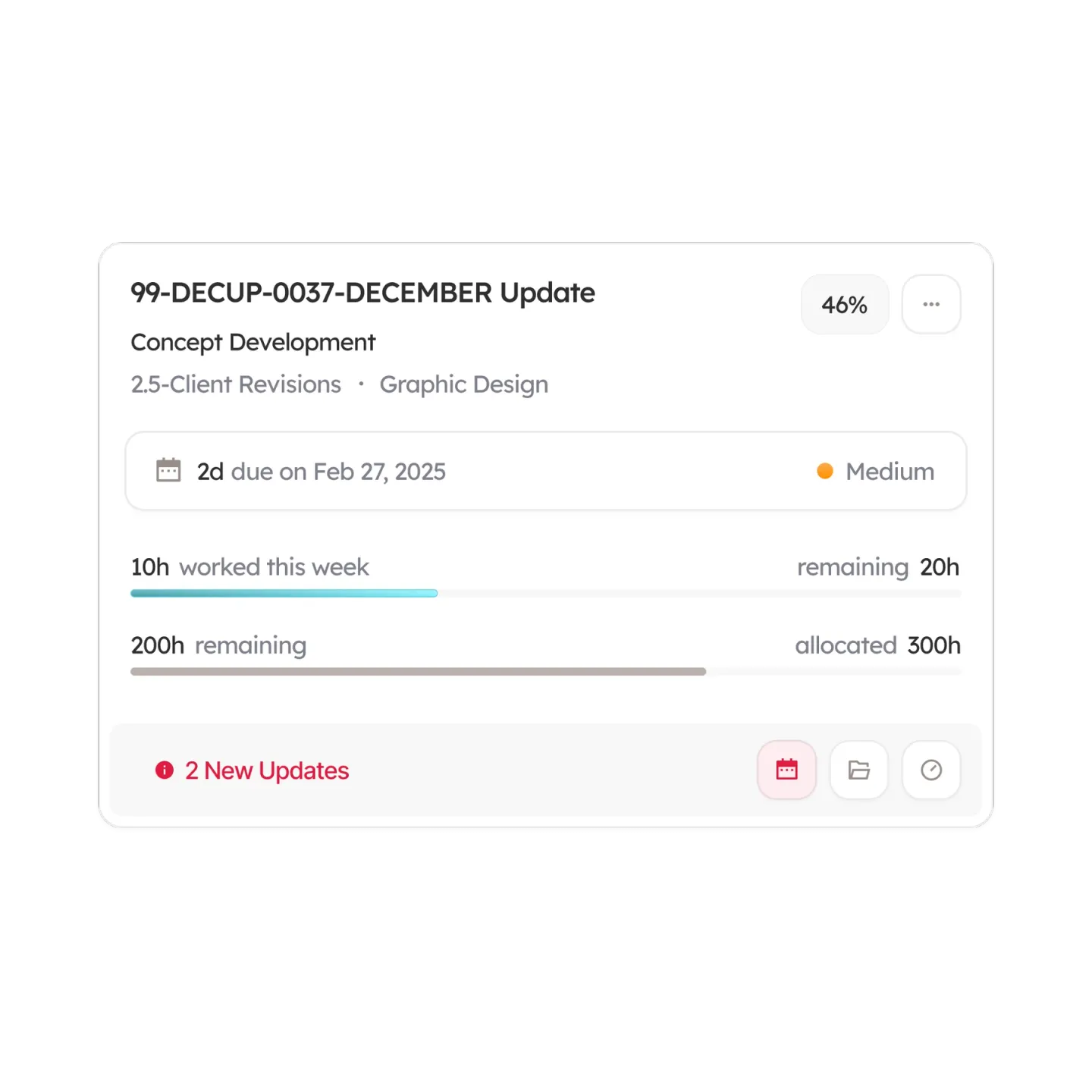
The working day
Most of an agency's day in Workamajig is small, repeated work: answering a thread, checking what is due, logging hours. Those screens got the same care as the big dashboards.
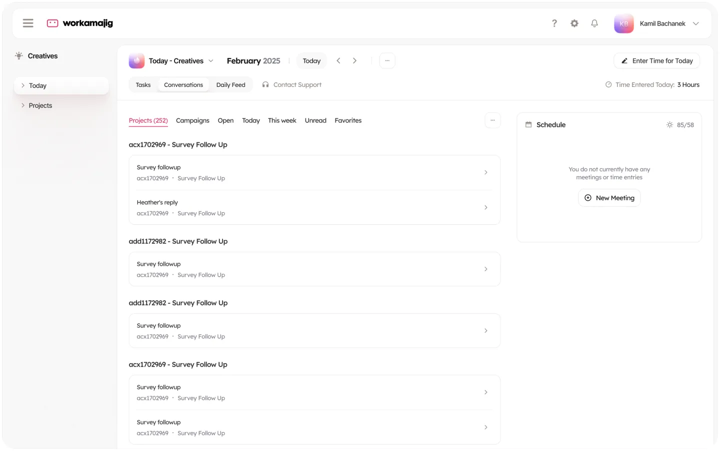
The Today page splits into Tasks, Conversations and a Daily Feed, with quick filters for projects, campaigns, open items, today, this week, unread and favorites. A schedule panel sits on the right with a New Meeting button, and the hours entered today stay in view next to Enter Time for Today, so logging time is one click away.
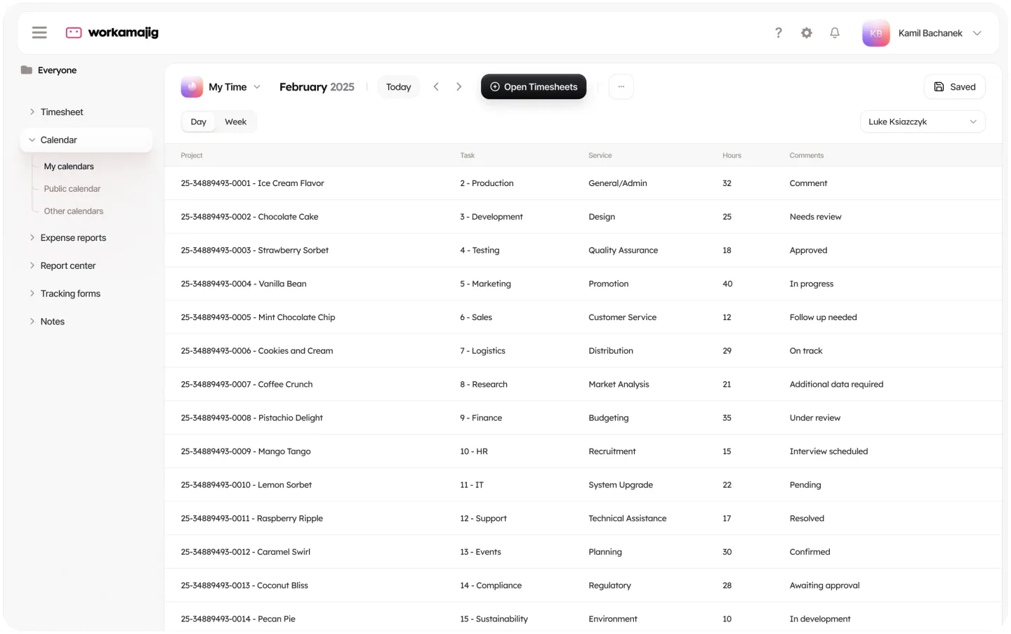
The timesheet lives under Everyone, because every role fills one in. It shows a day or a week of entries by project, task, service and hours, with a comment on each line. When a day is still empty it says so plainly, Add your first time entry for this date, with a single button to start.
The calendar
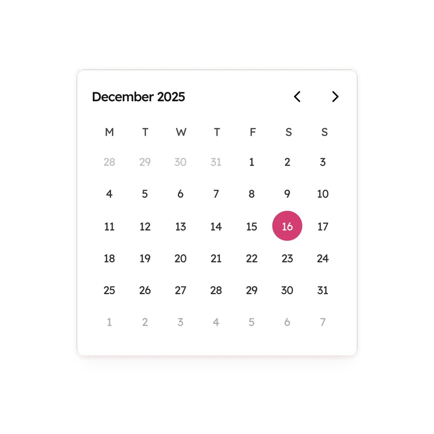
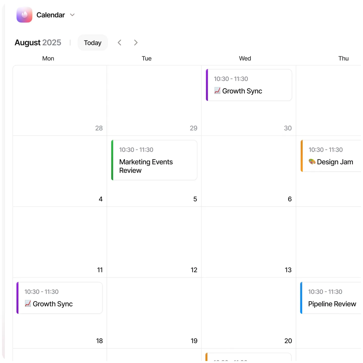
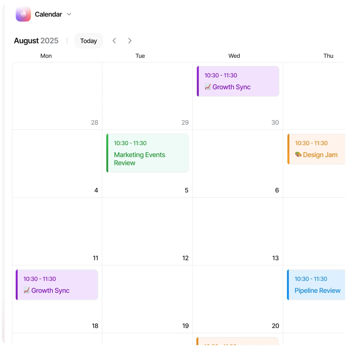
The calendar went through five versions in the first rounds, most of them about how a meeting should look in a busy month.
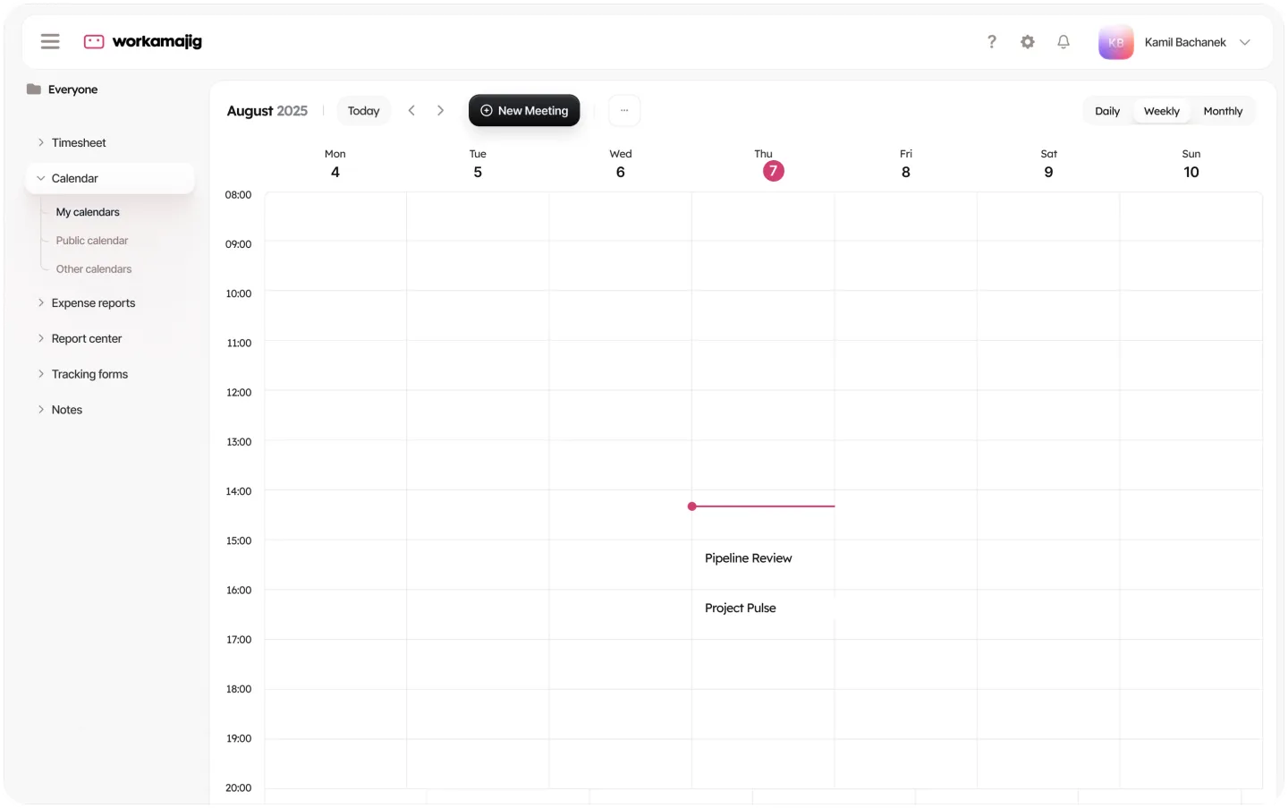
Version one kept every meeting white with a colored edge. Version three tinted the whole card in the meeting's color. The latest round brings the calendar into the new navigation, with daily, weekly and monthly views.
A switch at the top right moves between the three views, and New Meeting sits next to the date in the same dark button style as the other main actions. In the daily view a thin line in Workamajig pink marks the current time, so it is clear at a glance what is next.
Calendar, version 1 and version 3
Now: the website
With the product redesign under way, we pitched Workamajig a new website, so the first thing a new agency sees looks like the product it will use.
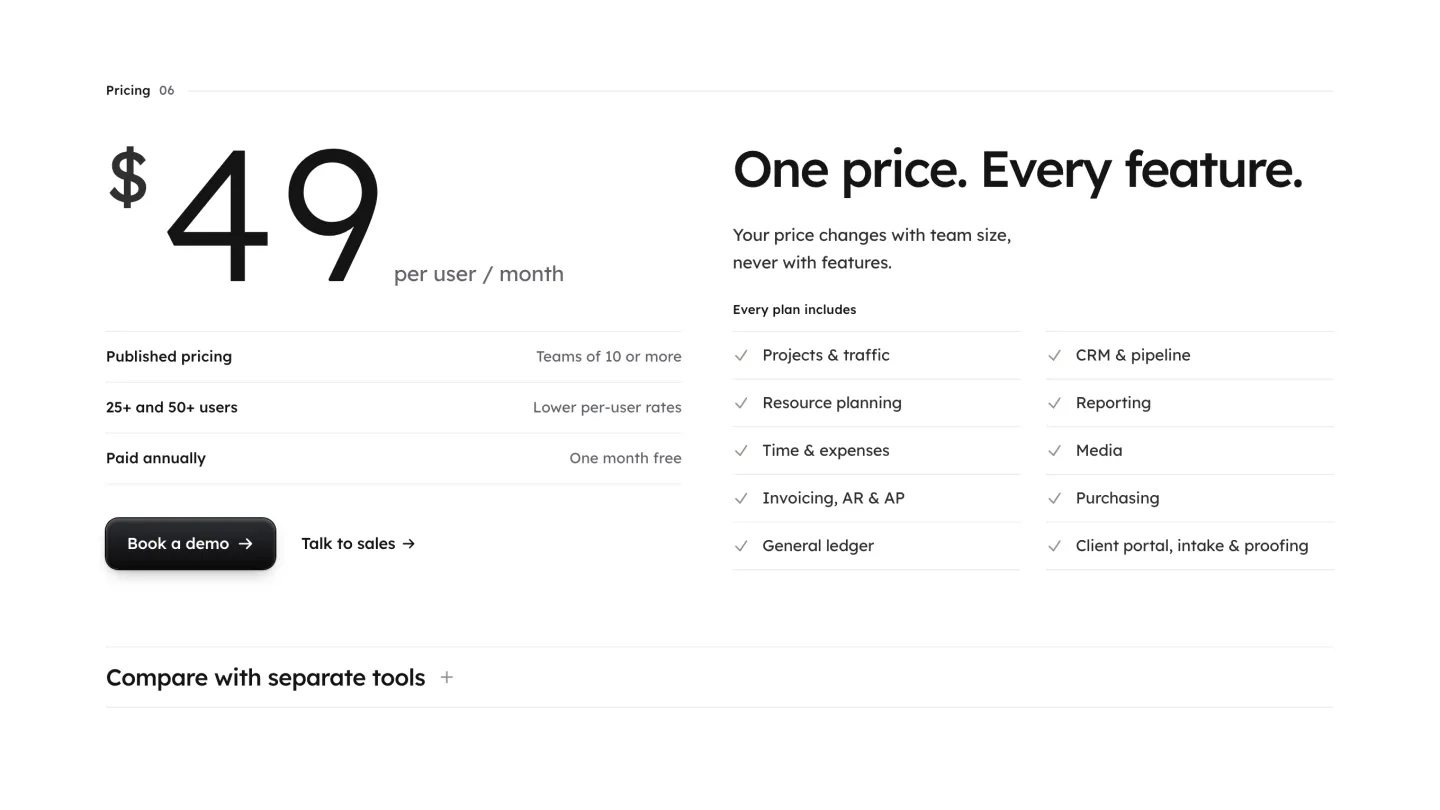
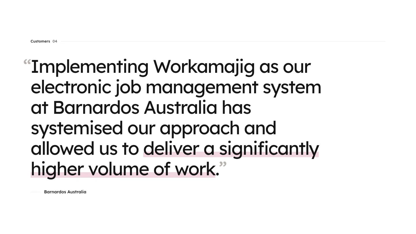
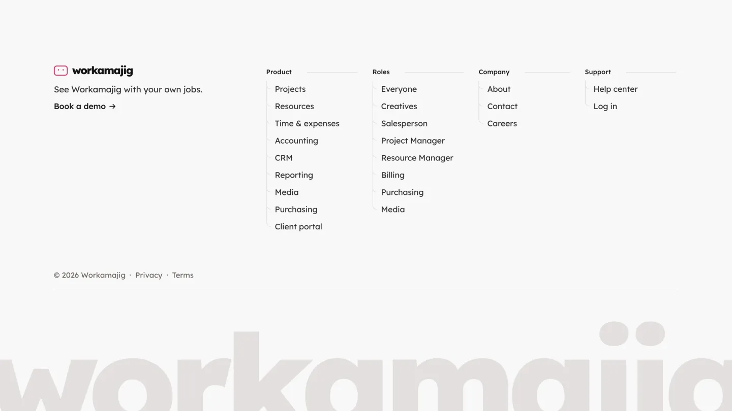
This is the direction we showed them: a launcher where each role opens its own screen, one published price for every feature, a customer quote and a calm footer that lists every role. It hasn't been approved yet and isn't live.
Website direction we pitched, not live yet
Results
The work is ongoing. The product keeps moving in rounds, the latest in the Figma file from March 2026, and the website follows.
So far that adds up to a redesigned screen set for six roles, a navigation that keeps the role-first habit of a product agencies have used for decades, and a shared set of parts (cards, pickers, charts, tables and calendars) the next screens are built from.
- Roles with redesigned screens, from creatives to billing
- 6
- Versions of the navigation bar in the 2026 rounds
- 4
- Versions of the calendar in the first rounds
- 5


- Helping a 1M+ user sales platform improve website engagement and conversion rates.
- Designed the brand and digital experience for a $72M-funded next-gen narrow bank platform.
- Refreshing the brand, the product and the website experience behind Lightdash’s $11M Series A
- Redesigning and rebuilding the mobile experience for an AI-powered athlete development app with 300K+ users.





You've reached the end, so now…
Tell us what you’re building.
We’ll help you map the right scope, team, timeline, and next steps.
Book a call