Overview
From a rough concept to a comprehensive travel solution in 3 months
With just 30 screens and a rough outline, we partnered with Mike to turn his initial idea into a full-blown mobile and web app, complete with a redesigned website, branding, and marketing collateral.
- From an idea to the MVP launch
- 3 months
- Web and mobile screens produced
- 200+
- Rating on App Store
- 5.0/5.0
"Not only can they can craft a great UI, they don't shy away from asking questions or politely challenging assumptions in order to arrive at the best-possible UX. Enjoyed working with them immensely and I hope to have the chance to do so again soon!"
 Mike O'NeillFounder @TravelWith
About the project
TravelWith is a trip planner for solo travellers, groups and families. It keeps the flights, hotels, transport and documents for each trip in one place, and lets everyone on the trip plan it together, on iPhone and on the web.
Its founder, Mike O’Neill, came to us with about 30 screens and a rough outline. Over three months we turned them into a full mobile and web app, then gave TravelWith a brand direction, a website and launch collateral.
By launch the product had grown to more than 200 web and mobile screens. We worked as Mike’s product design team: mapping the flows, designing every state of every screen, and asking questions along the way. In his words, we didn’t shy away from politely challenging assumptions to get to the best UX.
- Client
- TravelWith
- Industry
- Travel, consumer app
- Services
- Product design (iOS and web app) · UX flows · Brand direction · Illustration · Website design · Marketing collateral
- Timeline
- 2024 to 2025
The challenge
Mike knew what TravelWith should do: put a whole trip in one place that everyone on it can see. About 30 screens covered part of that, and most flows were still to be designed.
- Many kinds of bookings
- Flights, hotels, transport and activities arrive in different formats, and all had to fit one itinerary.
- A trip for a group
- Invites, participants and notifications had to work for everyone on the trip, not only the person who booked it.
- Three months to launch
- The mobile app, the web app, the brand and the website all had to be ready for the MVP launch.
- Free and paid
- The free app had to be useful on its own, with paid features that feel worth upgrading for rather than locked away.
We started from the trip itself and worked outwards: what a trip holds, who can see and change it, and what happens when plans move, like a delayed flight or a change in who is coming. Every flow after that hangs off the same trip card.
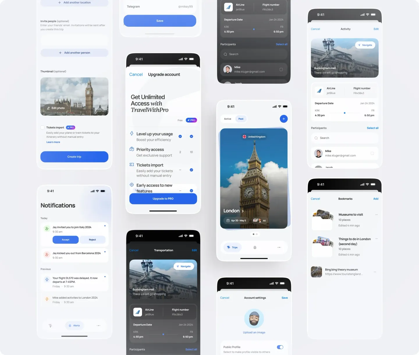
Trips, together
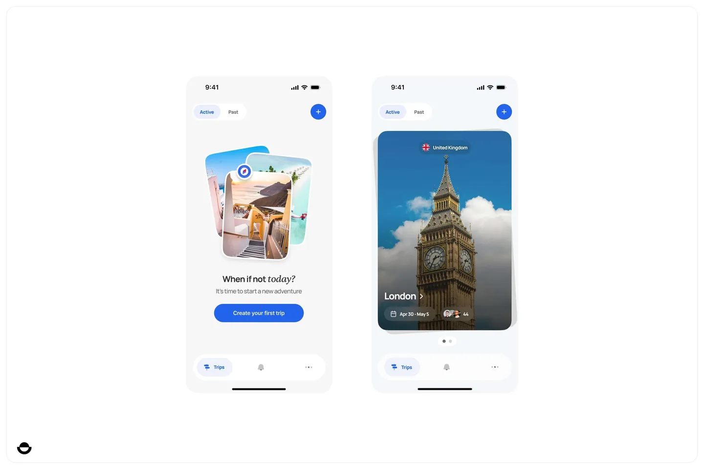
The app is built around trips. A new account starts on an empty state that invites you to create the first one; after that, each trip opens as a card with its dates and the people on it.
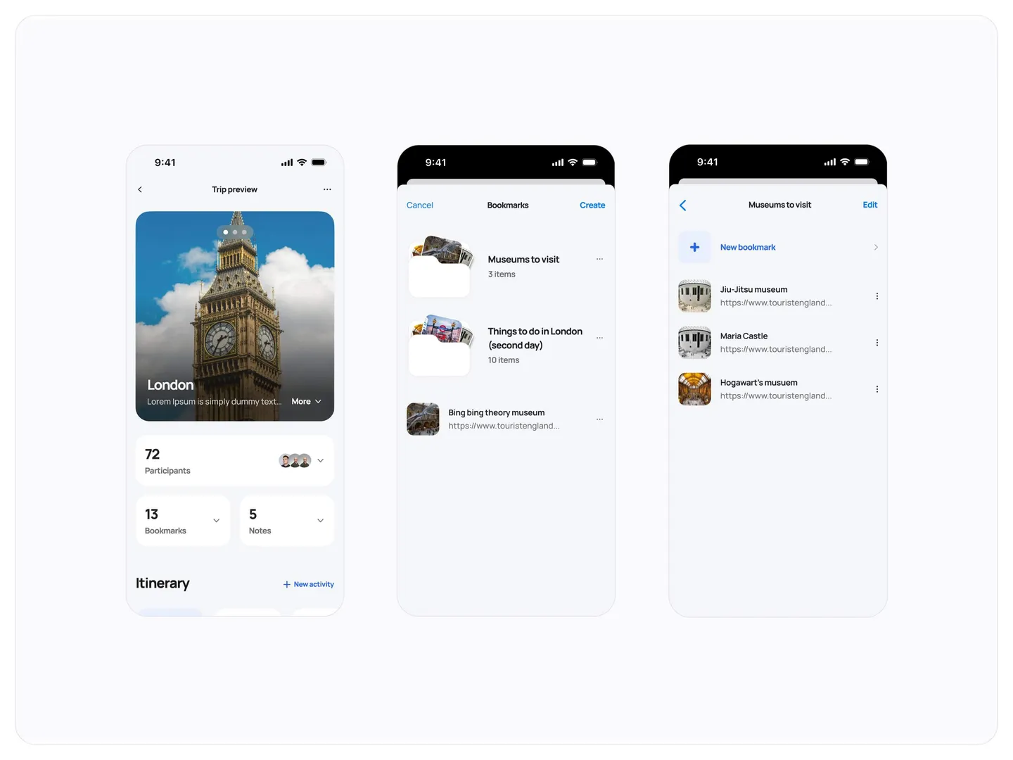
Inside a trip sit the participants, bookmarks, notes and the itinerary. Bookmarks group the places to visit, with links saved from anywhere.
- Creating a trip
- One form covers the destination, extra locations, friends to invite by email and an optional thumbnail photo. Invitations go out once the trip is created.
- Bookings as cards
- Flights show the airline, flight number, departure date and times on a simple route line; activities carry a photo, a note and a Navigate button.
- Notifications
- Invites to a trip come with Accept and Reject buttons, next to updates such as a delayed flight or a friend adding activities.
- Active and past
- Trips sit in two tabs, active and past, so a finished trip stays one tap away.
The web app
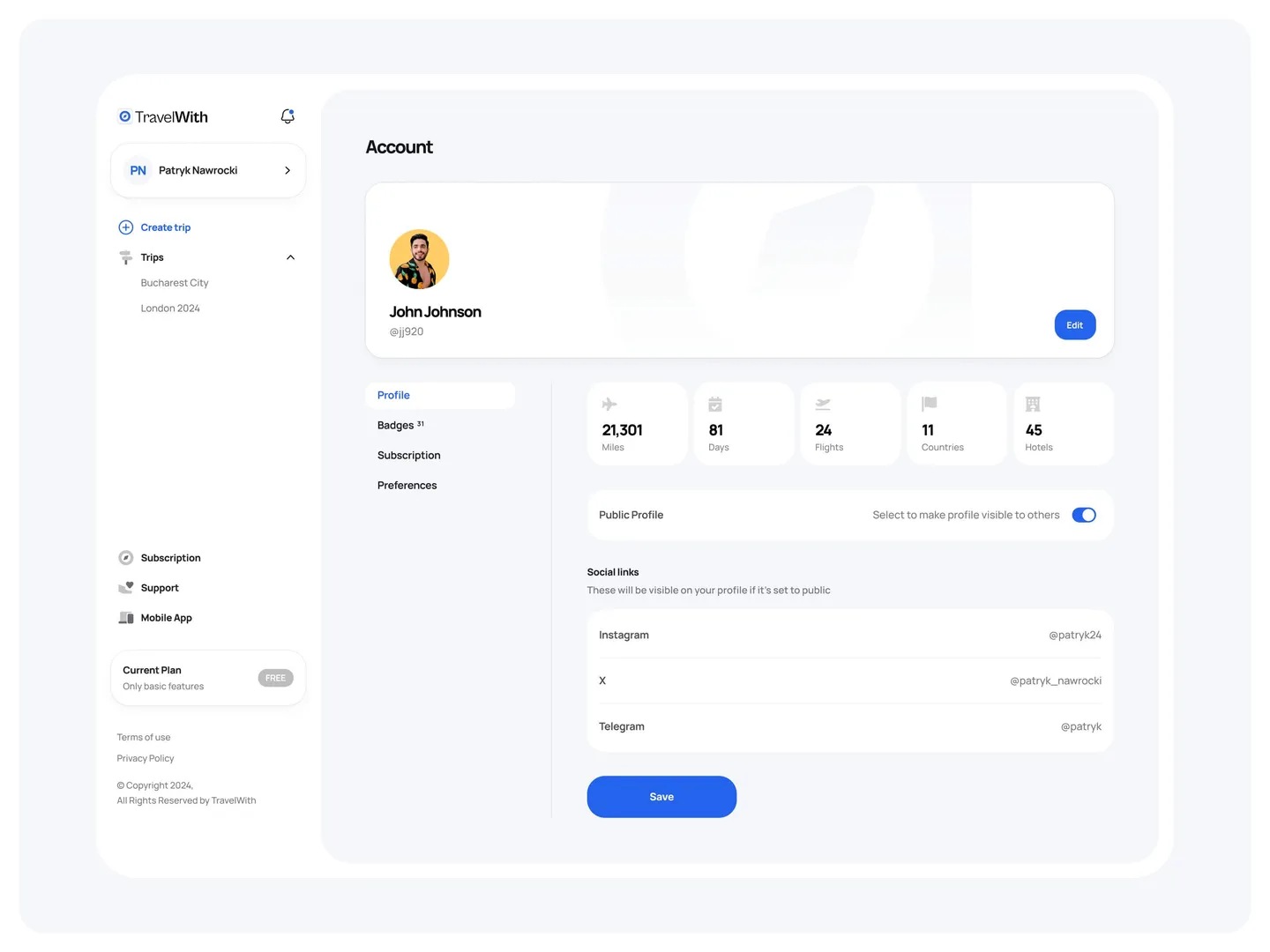
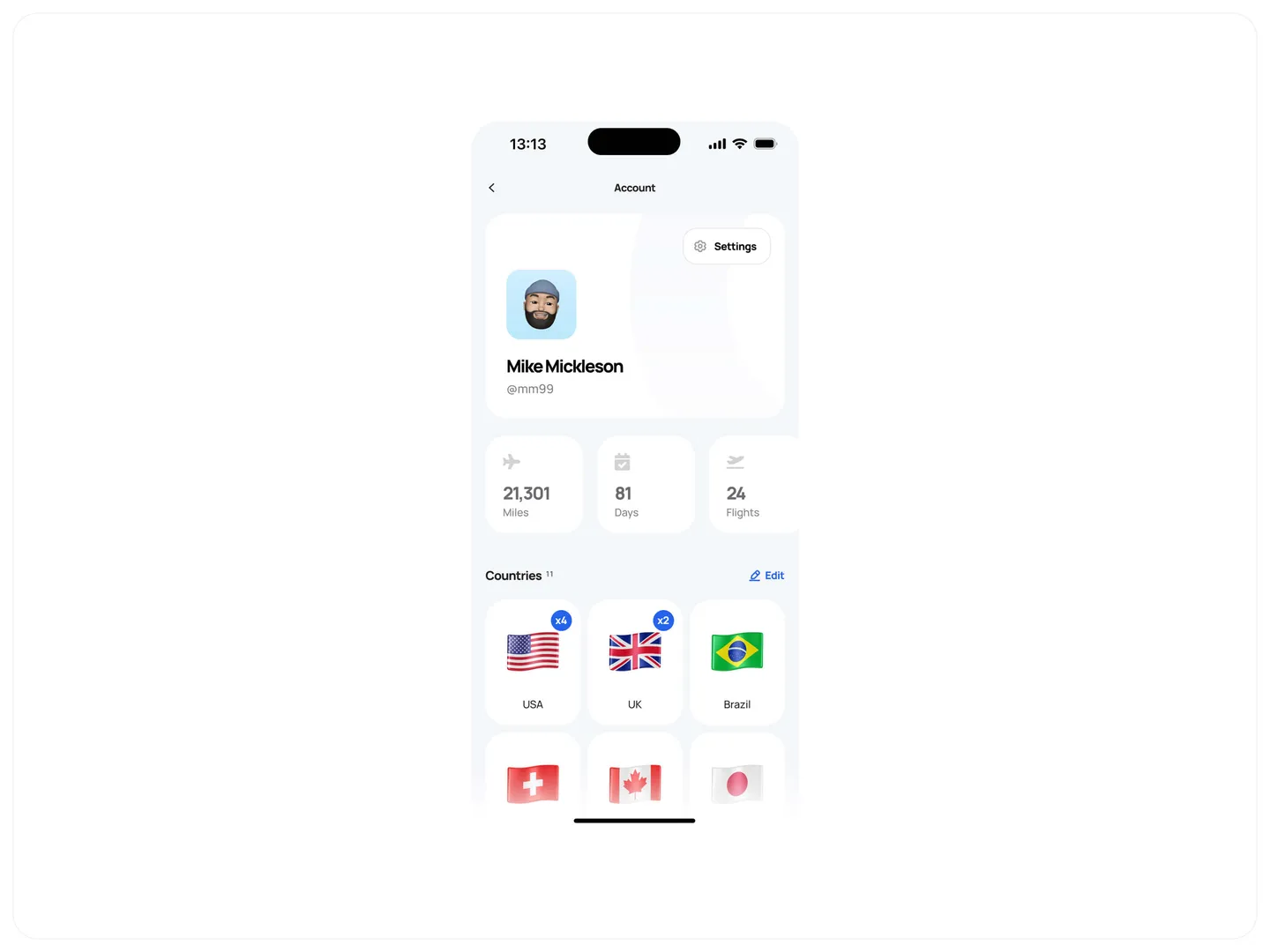
The same account works on the web, with trips in a sidebar and a profile that counts miles, days, flights, countries and hotels.
Profiles can be public or private, with social links for the people you travel with.
The sidebar keeps Create trip and every trip one click away, with subscription, support and a link to the mobile app below. The account page adds badges, subscription and preferences tabs, and a Current Plan card shows at a glance whether you’re on the free plan.
Sign-up and Plus
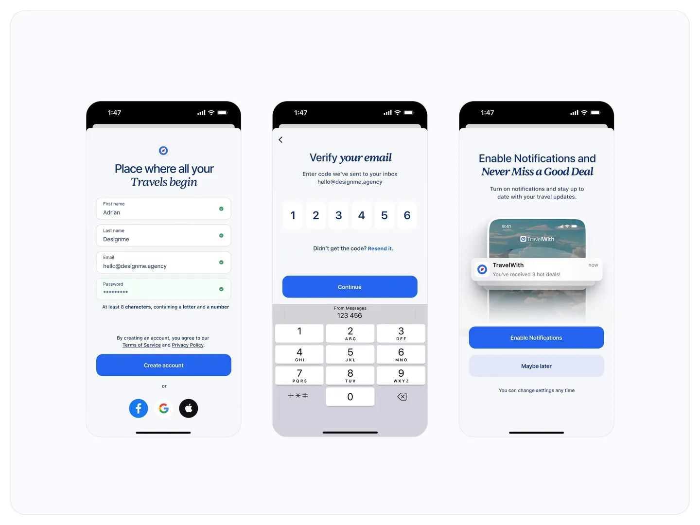
Sign-up takes three steps: create an account, verify the email with a code, and turn on notifications for travel updates and deals.
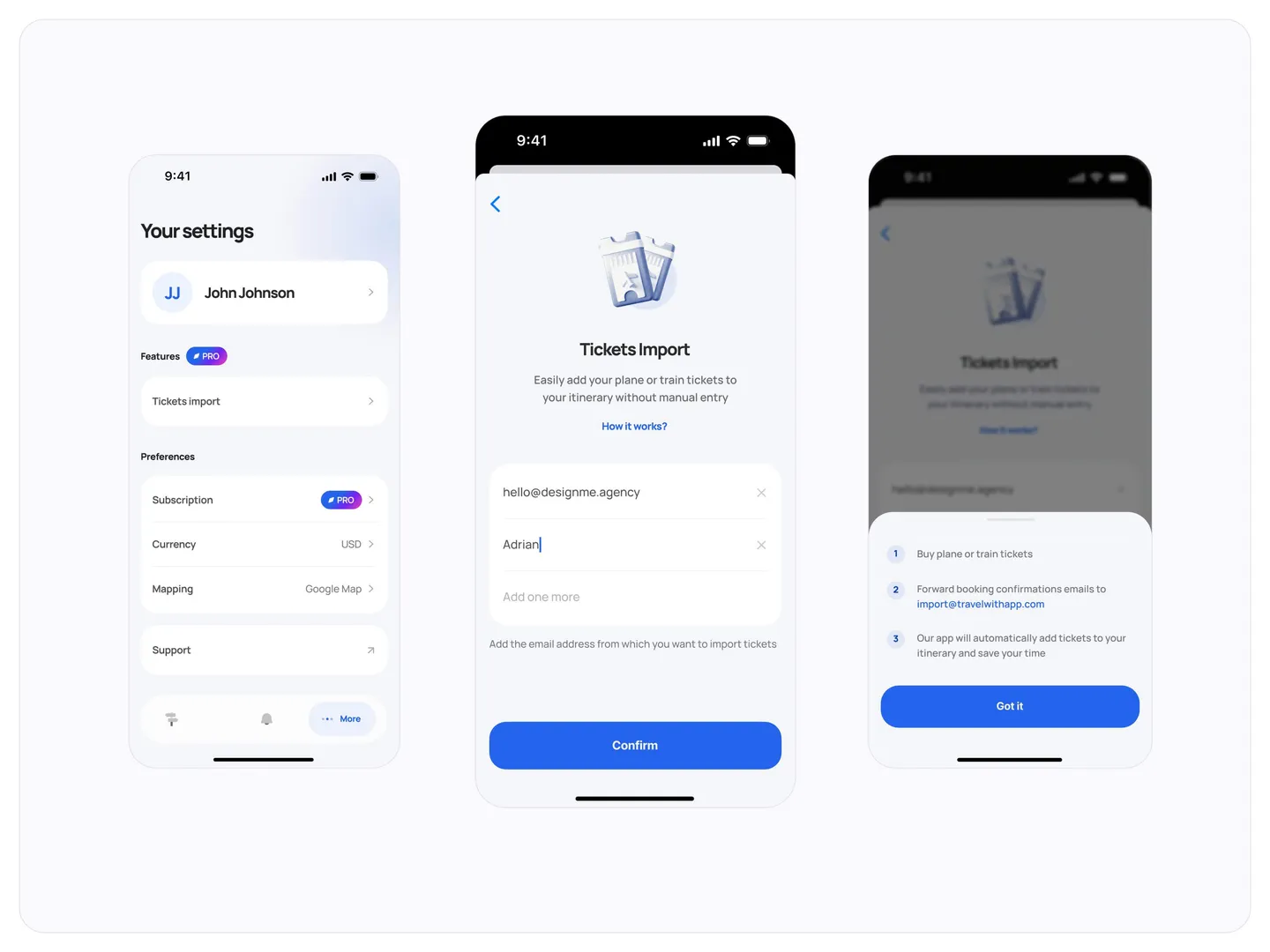
Plus features sit in settings, starting with tickets import: forward a booking confirmation to TravelWith and the tickets land in the itinerary without typing them in.
The upgrade screen, Get Unlimited Access with TravelWithPro, compares the free and paid plans line by line: usage, priority access, tickets import and early access to new features. Paid features also show a small PRO tag wherever they appear in the app, such as the tickets import option on the create-a-trip form, so people discover them in context instead of on a sales page.
Brand and illustration
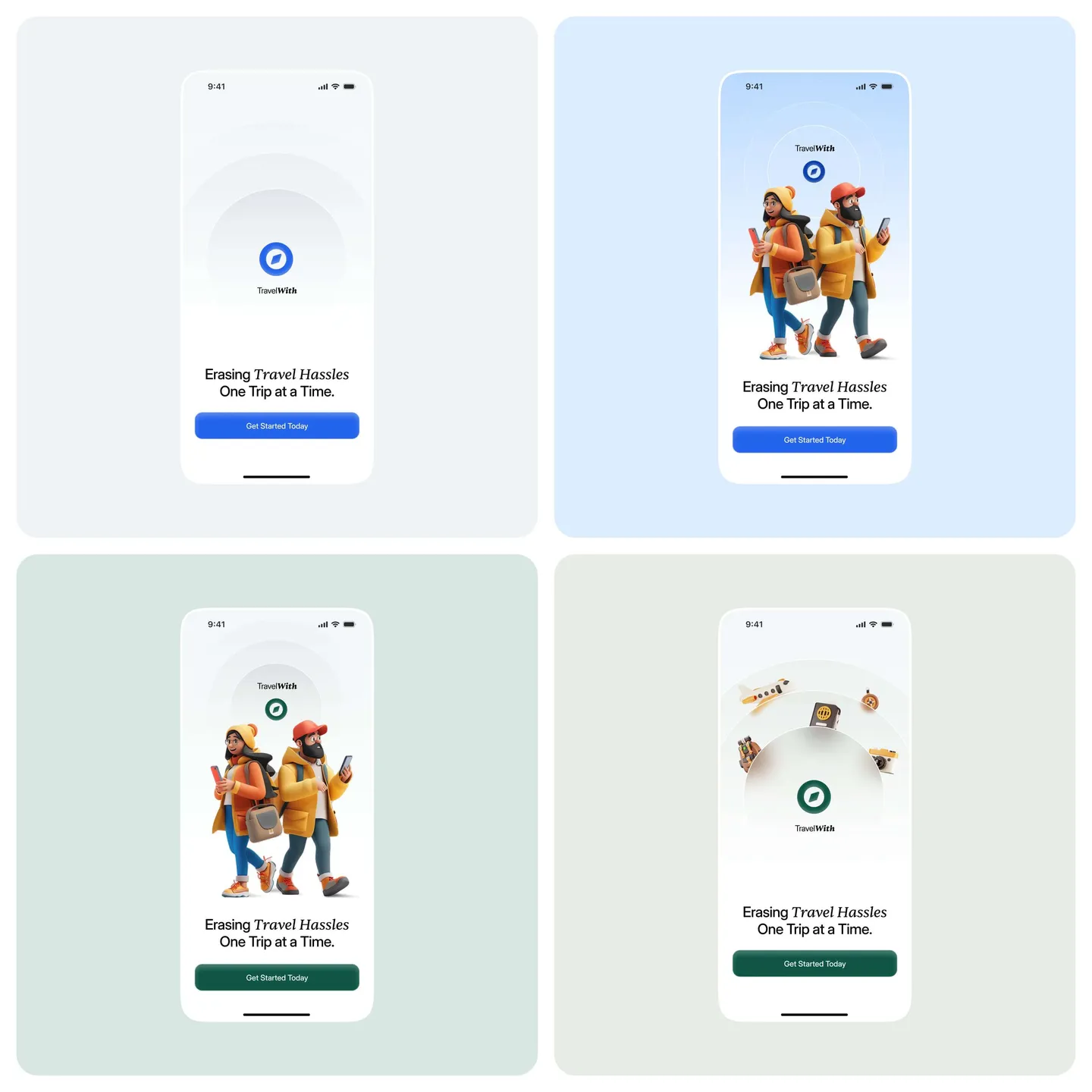
The brand keeps a compass as its symbol. We tested the welcome screen in four looks, from plain blue to 3D travellers on blue and green.
The serif italic in lines like Erasing travel hassles, one trip at a time carries through to the website.
Around it the product stays clean and bright: a single strong blue for actions, soft grey cards, rounded corners and full-bleed destination photos that do most of the decorating. The same blue and the same photo-led trip cards run from the app icon to the pricing page, so the app and the site feel like one product.
The website
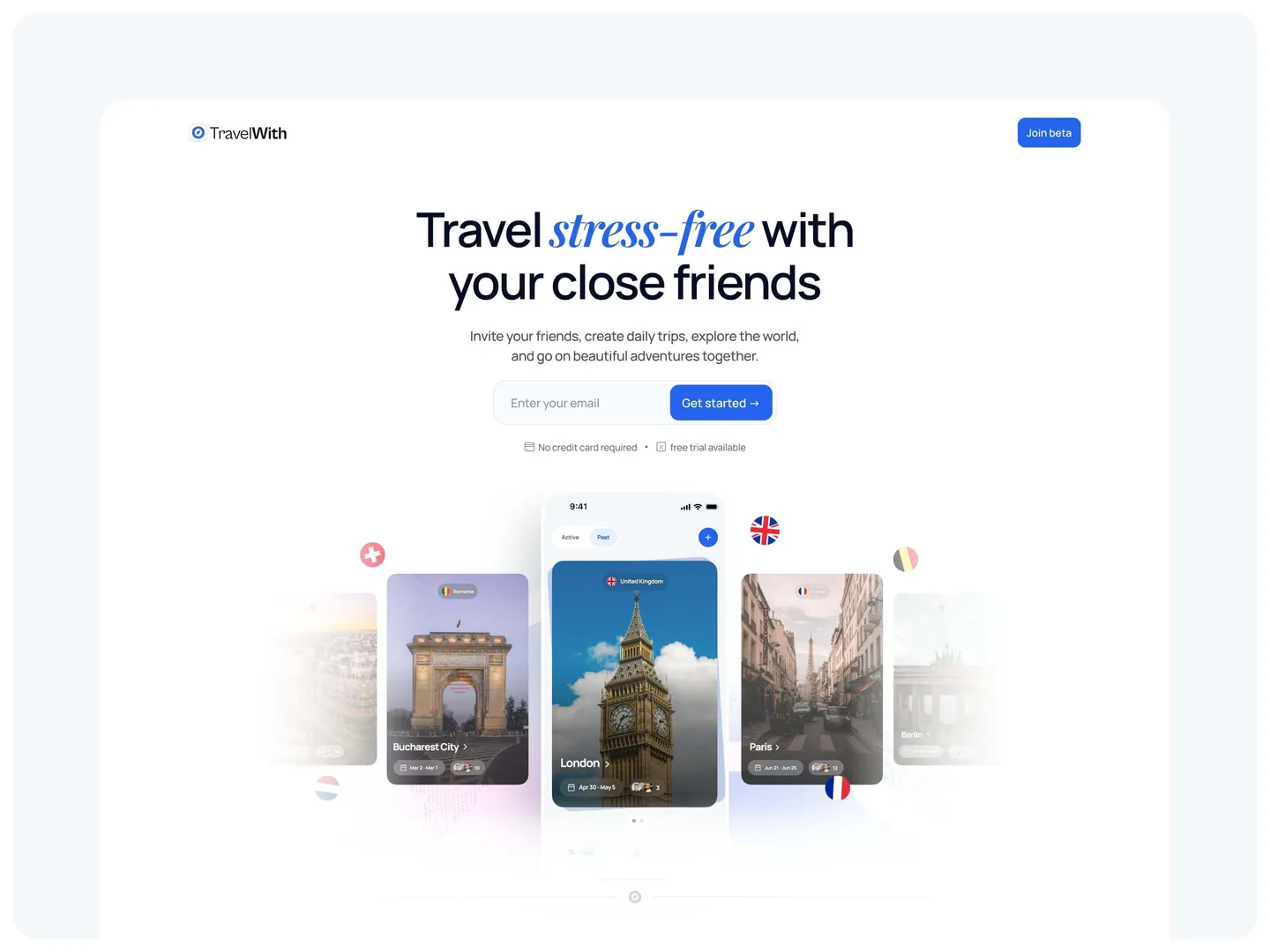
The website opened the beta: Travel stress-free with your close friends, an email field to join, and the app’s trip cards fanned out underneath.
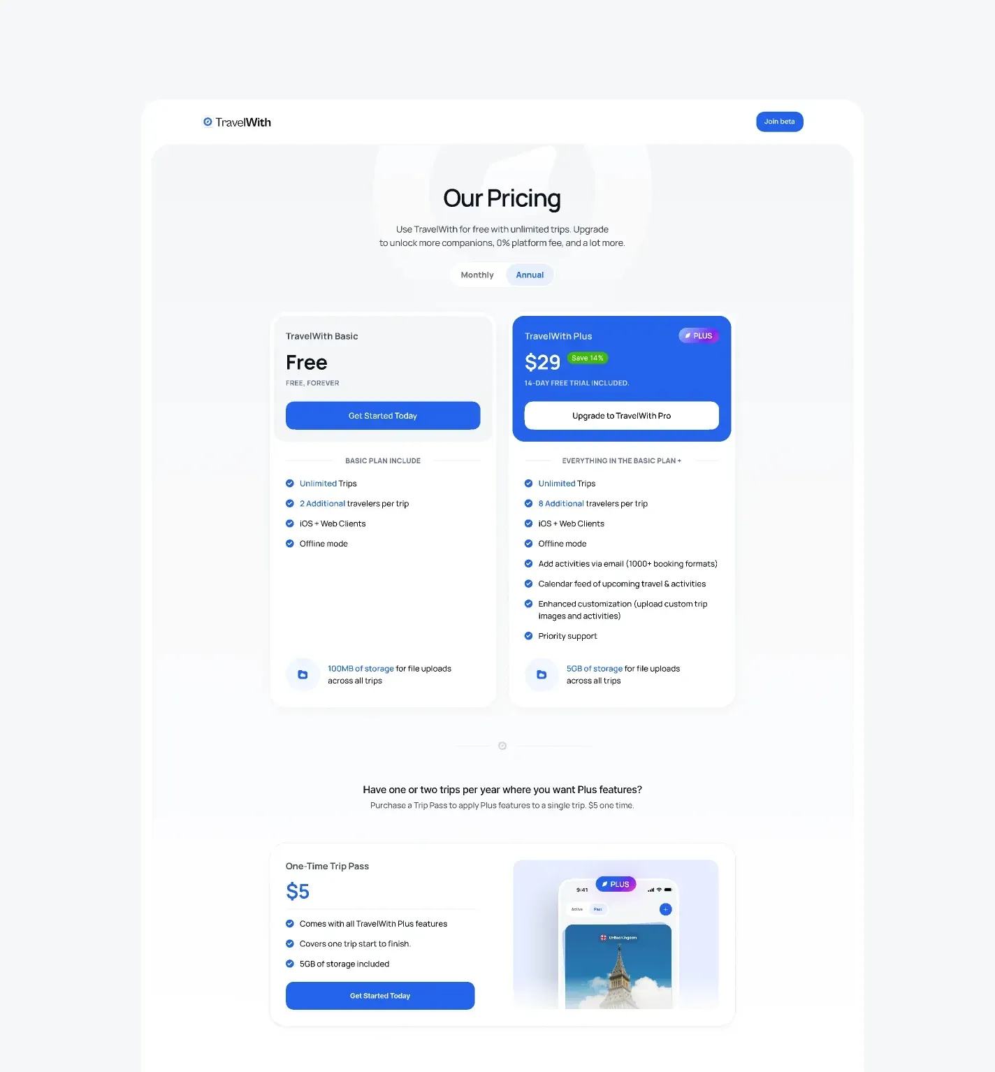
A pricing page compares the free plan with Plus and offers a one-time pass for a single trip. The app went on to a 5.0 rating on the App Store.
The plans are written as features people understand: unlimited trips, more travellers per trip, iOS and web clients, offline mode, adding activities by email, a calendar feed of upcoming travel and storage for file uploads. A monthly and annual switch sits at the top, and the trip pass answers the traveller who only needs Plus for one or two trips a year.
Results
TravelWith went from about 30 screens and a rough outline to a launched mobile and web app in three months, with a brand direction, a website and launch collateral around it.
The MVP shipped with more than 200 web and mobile screens covering trips, bookings, invites, notifications, profiles and paid plans, and the app holds a 5.0 rating on the App Store. Mike summed up the partnership in one line: he enjoyed working with us immensely and hopes to do so again.
- From an idea to the MVP launch
- 3 months
- Web and mobile screens produced
- 200+
- Rating on the App Store
- 5.0/5.0
Keep reading
More case studies
Planning something similar? Browse more consumer app work or see pricing.



- Helping a 1M+ user sales platform improve website engagement and conversion rates.
- Designed the brand and digital experience for a $72M-funded next-gen narrow bank platform.
- Refreshing the brand, the product and the website experience behind Lightdash’s $11M Series A
- Redesigning and rebuilding the mobile experience for an AI-powered athlete development app with 300K+ users.


You've reached the end, so now…
Tell us what you’re building.
We’ll help you map the right scope, team, timeline, and next steps.
Book a call